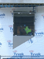
 It is no secret that I am not exactly a fan of the Art History addition to Yale's A+A building, but lately I've been trying to give it the benefit of the doubt. Construction is coming along nicely, and the massing of the building when viewed from York Street near the Yale Repertory Theatre is actually not bad. Though I am still disappointed that the panoramic view to campus from the architecture studios has been lost with the construction of the Art History building, I have been trying to change my attitude toward the building over all and take it for what it is. After all, it is a tough site for any architect, and who can really compete with Rudolph's A+A and across the street from two beautiful Kahn museums!
 That was until I saw this. No, not the silly construction worker, but the window he is posing in. I have been wondering about this window for a few weeks as I have watched it being built. When it first went up, I thought that it looked like it was not properly installed or they were still working on it. Then came the triangular metal panel underneath which sealed the deal: this thing is here to stay.
You might think this is just a window and that it is no big deal, but the window is just a symptom of a larger issue. This key feature on the facade continues to reinforce one of my early criticisms of the building: the addition is simply too "busy" to provide a neutral and respectful backdrop for the A+A. It is just another random feature on a jumbled composition of forms with too many ideas vying for attention at once.
 Call me a Modernist (don't worry, I won't be offended), but Rudolph's and Kahn's buildings are so much better than the Art History addition that I just cannot seem to get over it. True, in the scheme of things, the Art History addition is much better than a lot of architecture in the world. But a lot of architecture is not next to three world-class buildings by two of the world's greatest Modern architects! Because of this, Yale University and Charles Gwathmey should have been held to a higher standard of design. But in my humble--but firm--opinion, it appears that the result of their collaboration in this case may end up being as bad as I had feared.
I find myself less and less interested in architecturally 'interesting' buildings. In fact many of my favourite spaces are architecturally rather simple, dare I say boring.
ReplyDeleteTrue, but my concern is that I do not think the Art History building is either interesting OR boring. It exists in some strange sort of middle ground where it is trying way too hard to be interesting and has, therefore, resulted in a building with too many different design strategies and manipulations going on to be boring.
ReplyDeleteIf I where to look at it in Venturi's terms (he who gave us "ugly and ordinary"), I would say that the building is too busy to be a good decorated shed, but it is not a good duck either!