Saturday, September 17, 2011

Experiments in Furniture Refinishing: Part 1

I have not been able to walk by the English Building Market here in New Haven lately without buying some new (old) piece of furniture.  A few weeks ago, we finally found the twin to a chair we have in our living room allowing us to complete the seating arrangement.  And just this week, I picked up a set of four dining chairs for pretty cheap.


These unique three-legged chairs were designed in the early 1950s by Hans Olsen and manufactured by Frem Røjle in Denmark.  The branding stamp is pretty clear on the bottom of all four chairs, and one of the chairs still has a sticker that says "Danish Furnituremakers Control."


The chairs are made of solid teak with a vinyl seat and the set of four were intended to nest around a small circular table which was, unfortunately, not available at the Market (see below; not my photo).  In good condition, I have seen the table and chair set sell for a couple thousand dollars online.  There is also a version of the table available that expands to seat six with two additional chairs--sounds perfect for our little family.  I guess that means we are on the lookout for two more chairs and a table now!


Though the chairs are in fair condition and I originally thought I would just clean them up and oil or wax them, wobbly joints, a chewed up corner, and a split frame on one have made me decide to disassemble and re-glue all the joints of the chairs.  I have already disassembled and started cleaning up one of the chairs as a test.  I am reasonably competent around furniture and in the shop, so it seems like it will be pretty straightforward to put back together with a little wood glue and a strap clamp.  (I hope I do not have to eat my words later!)


I guess there could be worse things in the world to collect than awesome vintage modern furniture bought for cheap!  But something tells me if this little refinishing/restoring experiment is a success, I may have found a new hobby.

Sunday, September 11, 2011

In Memoriam

Ten years ago, I was a senior at Georgia Tech studying architecture. Feeling a bit under the weather, I had decided to skip my morning structures class, and I was sleeping when a phone call from a friend startled me awake. I could not believe what I was hearing when she said, "the World Trade Center has been attacked and one of the towers just fell." As an architect, I could not even grasp the concept of a building that large falling. It was surreal as I turned on the television to see replays of the tower collapsing on itself. Unsure of what was going on and whether other large cities such as Atlanta would be a target, we got a small group together and went to my friend's parents' house outside Atlanta and watched the news all day. It was unreal.

In more recent history, I have been slowly but surely cleaning our basement, which includes going through and organizing a number of old boxes. It dawned on me as we approached the tenth anniversary of the 9|11 attacks that back in high school, I went with my father to photograph skyscrapers in New York City for a class project.  After looking through a couple of boxes marked "photos," I was able to find a pile of photos of New York and felt it would be a nice tribute to post photos of the World Trade Center.

Most of the photos are in black and white and they were shot with 35mm film.  They were probably taken in 1997 or 1998, but I cannot remember.  After I scanned the photos, I did a little bit of digital doctoring, but did not want to do too much to them as I think the tones and textures of the imperfect photos give them an air of nostalgia.


This photograph above was one of two photographs of the World Trade Center I chose to have enlarged for my class project.  I think I called it Tracks, and I paired it with the photograph below, entitled Chambers WTC, of the World Trade Center subway station.  I always felt the photograph of the station had an air of melancholy.   Though according to Wikipedia the Chambers WTC subway station survived the 9|11 attacks, I still think there is something sad about the photograph.


I think this photograph epitomizes the typical view of the World Trade Center and is taken from across the Hudson River in New Jersey.  Looking back at the photo now, I am struck at the scale and height of the massive towers, easily twice as tall as anything else around them.  (Note the Woolworth Building, just to the left of the World Trade Center towers.  It was once the world's tallest building!)


If my research is correct, I think this is a view looking south toward the north face of the base of the South Tower from across Tobin Plaza.  The sculpture is called Ideogram by artist James Rosati, and was destroyed on 11 September 2001.  The 200+ foot broad face width of each square tower easily accepted the full wingspan of the Boeing 767s that hit them in the attacks.


The view up between the towers can only be described as dizzying.  It is hard to believe that in 1974, French aerialist Philippe Petit strung a wire between this gap and performed a "dance" between the towers more than a thousand feet above the pavement.  (There is a great documentary about Petit's amazing feat called Man on Wire, which I very much recommend.)


Yes, I count myself among the architects who love to take photographs looking up the corner of tall buildings.


Another view up one of the towers through the leaves of a tree on the plaza.


In my attempt to be artistic, I had wanted to document the elevator doors of New York's tallest buildings.  I thought it would make a cool series to see how their design and ornament changed over time.  After having a difficult time getting permission to photograph in the Empire State Building, Chrysler Building, and Woolworth Building, we were not only allowed to photograph in the World Trade Center lobby, but also to set up a tripod!  If you look carefully, you can clearly see the tripod in the photograph.  My father and I are also visible in the slightly distorted reflection of the chromed doors.

This photograph of the World Trade Center elevator doors was taken at the moment the doors were either opening or closing, I cannot remember.  You can see the ghostly image of people inside the elevator cab, and looking at the photograph now, I am haunted wondering if any of these people were in the towers on 11 September 2001.


We went up to the observation deck on the top of the South Tower that day.  Though I cannot remember if it was particularly windy, I do distinctly remember the uneasy feeling of the building moving slightly beneath my feet.
A view north toward Midtown that will never be again, with the Empire State Building front and center.  This part of the city has changed significantly in the past ten years, including the addition of the Time Warner Center, New York Times Building, Bank of America Tower, and Hearst Tower to the skyline.


A view south over New York harbor toward the Statue of Liberty.


Another view south toward Governors Island, with the Verrazano Narrows Bridge in the distance.


A view looking west up at the towers from Liberty Street.  The steel facade of One Liberty Plaza is in the foreground on the right edge of the photograph.  One Liberty Plaza suffered broken windows but no major damage in the 9|11 attacks.


This photograph shows the South Tower reflected in the facade of the Deutsche Bank Building.  The Deutsche Bank Building sustained massive damage, including a 24 story tall gash in the facade, when the South Tower fell and was subsequently dismantled.


I cannot be sure, but I think this staircase was near the base of the Deutsche Bank Building.  I am pretty positive the small amount of facade showing at the upper left of the photograph is the old Marriott Hotel, and that this view is of the South Tower.  (If anyone knows where this staircase is--or was, rather--please leave me a comment.)


At the end of our trip photographing around Manhattan, my father and I took the ferry back to Jersey City where we had parked and set up the tripod to catch the downtown skyline slipping into the night.

Thursday, July 7, 2011

Inhotim

Last Sunday before leaving Belo Horizonte, we took a day trip to Inhotim, a stunning garden and contemporary art center about and hour-and-a-half away from the center of BH ("bay-aGAH") in the campo of Minas Gerais. The immaculate and extensive grounds house 17 gallery situated pavilions among lakes, lawns, and spectacular tropical landscaping.

I enjoyed the art to be sure. There was the Forty Part Motet, probably my favorite piece, which put a classical piece of music written in the 16th century for 40 voices in 40 different speakers arranged throughout a large room. It was pretty neat to walk around the room and be able to listen to each individual voice, then step to the center and hear the piece move back and forth all around you. Then there was Através, a study in barriers and transparency, where you walked around on broken glass--but only if you were not wearing sandals! And Celacanto Provoca Maremoto, a larger-than life version of traditional Portuguese azulejos, which I loved because it seemed so very Brazilian to me. Perhaps the most architectural of the art pieces was Invenção da cor, Penetrável Magic Square # 5, De Luxe, which was very much in the spirit of Latin American architecture, including the work of Mexican Modernist Luis Barragán.

But as an architect, I was also taken by the design of some of the galleries in the great spirit and legacy of Brazilian Modernism and the Burle-Marx-esque landscaping. It was really a spectacular day and a great visit to a stunning location.

Caught in the act! The architect taking pictures of an infinity-edge pool!

The main reception pavilion across one of the several lakes. The mountains in the background were really lovely.

This was my favorite of the galleries architecturally speaking (though it also contained one of my favorite pieces too, the one of the giant azulejos).

You entered the gallery across a causeway of sorts though a deep-blue-gree reflecting pool with a thin infinity edge.

After entering underneath the cubic gallery and seeing the artwork in a large, windowless room, a long ramp leads up to the rooftop for a great view of the surrounding landscape...

...then you exit across a metal-mesh bridge out of the opposite side of the gallery from which you entered.

This pavilion was pretty cool, too, with a sinuous bridge a la classic Brazilian Modernism.

The lake in front of this gallery had a much different feel than the reflecting pool in front of the other gallery. The appearance was more natural, but knowing a bit about landscape architecture, even the most "natural" of planned landscapes are planned just the same.

The education center had a really awesome water garden on the roof, with a number of different planting areas including some grasses and, one of my favorite, papyrus.

We ate at this restaurant, which had a series of really cool movable sunshades along the perimeter.

Some of the varied landscape around the grounds, featuring lush tropical vegetation.

Even some of the plants were architectural! I stepped underneath this grove and looked up thinking it was like the fan vaults of some great cathedral.

This was perhaps the most architectural of the exterior artworks, with bright colors and bold shapes. Very Latin America.

The pathways were made of huge irregularly-shaped stone pavers. The grass areas and lawns were immaculate.

A photograph up into a great grove of eucalyptus trees. I really love eucalyptus trees, which remind me of South America. Eucalyptus is found in Curitiba, and also where I was in Peru in February.

I know the photo is blurry, but there is just something about the colors of the houses and the color of the light at sunset in South America. This was taken from the bus on the way back from Inhotim to Belo Horizonte.

Monday, July 4, 2011

Caution! Modern Forms May Abound!

Whenever I travel to Latin America, I feel right at home. There is just something about the people, the sunlight, the landscape, the cities . . . the buildings.

Yes, in case you had not already guessed from previous entries, I love Latin American architecture. I love the courtyards, the gates and fences, the colors, the tiles, the lush gardens, the concrete pile fences, the inside/outside living. I love that in Latin America more than anywhere else I have traveled, Modern architecture with the capital "M" is everywhere and is thriving. Where you can see Modern forms at work, having fun, living a little, stepping out of the box. Yeah, I love fun Modernism!

Brazil is a country that appreciates its Modern architecture, and they are proud of their architectural heritage, especially their own Oscar Niemeyer, last of the great living true-Modernists . . . communist, exile . . . visionary, artist . . . And I might consider him the epitome of the "fun" Modernists!

I am writing this post from Brazil, where I am with my family on month-long vacation. (I have promised them I will not turn the whole event into an architectural tour, but how can I help what I see when we're walking to the market!?) Our first stop is the city of Belo Horizonte, where Niemeyer did some of his early work, that is pre-Brasilia work. In the suburb of Pampulha, Niemeyer designed a number of buildings, including among other works the famous Chapel of São Francisco de Assis. Though a visit to Pampulha is not planned until we return to BH at the tail end of our trip (yes, that I had approval to set aside a day for on the itinerary!), I have already had the opportunity to see one of Niemeyer's residential apartments, the Edifício Niemeyer (1955), located downtown at the Praça da Liberdade.

The Edifício Niemeyer is characterized by its sinuous curved floors plates, giant concrete overhangs, tile work and ribbon window enclosure, and being lifted above the ground in true Modern fashion. It is at the same time very Modern, very Latin American, very Niemeyer, very Brazil.

We were looking for a supermarket, but found cool Modern architecture instead!

It reminds me a lot of a radiator . . . and of a model I once made in architecture school out of stacked paper.

The building sits on a sloped site, on a small triangular block. From the low-side of the site, the building really towers above the street.

A classic Modern detail: lifting the first occupied floor above the ground on columns--or in this case, concrete walls.

If you look closely, you can see the tile work on the exterior walls. I do not think any of the overhangs are balconies. Actually, now that I think about it, there may be 2 or 3 overhanging sunshades per level, which is a sort of visual trick to make the building look taller since you would normally expect them to just be an extension of a floor slab once at every level.

A view of the building from the plaza across the street. Yes, very Modern, very Niemeyer, very Brazil . . .

On another note, here are a few more shots from our walks around the city. The center of Belo Horizonte is actually quite compact, and we walked a significant amount to see what we could see. It has a great urban feel . . . although we have since learned that everything closes early on weekends, and almost all "touristy" things are closed on Mondays! Funny that our visit started on Saturday and we are leaving on Tuesday to fly to Curitiba!

A view along one of Belo Horizonte's main streets, Avenida Afonso Pena.

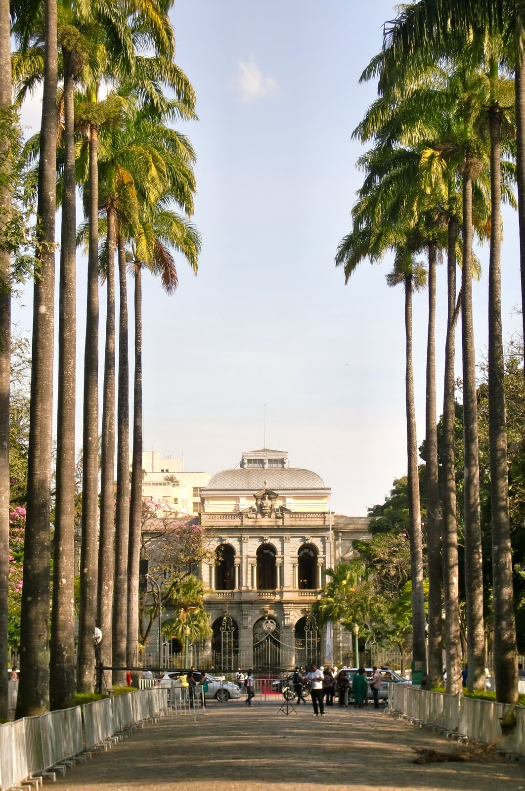
A view of the Palácio da Liberdade at the end of a palm-lined plaza. Actually, the Niemeyer building is just to the left of this building.

I have been instructed to include my family from time to time as I take pictures of architecture. It is actually a bit of a hard thing to do. I am so used to waiting until all the people leave the frame before I snap the shutter!

This was just a fun angle on a triangular building. Because of the angle of the view itself, it looked like a 25 story tall facade with nothing behind it! It was also an example of something that you never see in North America, but is really common down here: a skyscraper clad in tiles!

Oh, on the ride from the airport (which is a cool Modern building itself), we passed by the newly-consructed administrative center for the state of Minas Gerais, designed by Niemeyer. Very cool!