Thursday, September 12, 2013

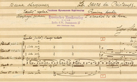
The Rite Stuff - Lesson 1 - Listening for the First Time

Introduction [2 min]

Provide only a brief introduction to the piece so as not to influence the activity with preconceived ideas:

The Rite of Spring is a piece of music written by Russian composer Igor Stravinsky. It was first performed in Paris in May of 2013 and is now more than 100 years old.


Activity [35-40 min]

Gather art and craft supplies. Listen to The Rite of Spring using it as inspiration for creating a single piece of artwork or a series of “scenes.” When the music is over, tell the group about your artwork and describe how you felt while listening to the piece.


Results

Though I was a bit nervous before we started about holding the kids' attention for the half-hour-long piece, our first lesson was a real success. The kids enjoyed the Rite, and the artwork kept them focused for the duration. At the end, they were even begging for the next lesson! I was really proud of them.

The artwork the kids produced was great. We asked them to really listen to the piece and be inspired by it, not just draw something preconceived. Listening to the descriptions of their own artwork, it was clear that they took the assignment seriously.

Brayan (age 8) produced several pieces:

His first shows a wizard with a magic staff. There are raindrops on at the top of the page. The zig-zag lines and spirals are his visual representation of some of the repetitive elements of the piece.

Part of the piece reminded him of a ship in a storm. He drew the waves and sky rhythmically to the timing of the music.

His last drawing shows a conductor with a baton, in a frenzy of activity, conducting the Rite. (I love the stern expression on the conductor's face! And is that baton smoking!?) The footprints relate to one particularly heavy part of the piece with lots of drums. The little diagonal slashes on the lower left say "Pip, Yow, Pip, Yow," also inspired by the instrumentation of the piece.

Luana (age 9) also created a few different drawings:

During the mysterious beginning of the piece, she drew a woman laying in bed "giving birth." (Spring? Rebirth? There is some sort of deep and astute meaning that she picked up on in this one, I am sure.)

The next drawing presented the idea of different seasons during the different movements. From top to bottom she shows a lightning storm, gently falling snow, and then spring flowers.

Part of the piece reminded her of a party. This is a group of people dancing for Cinco de Mayo--notice the red and green decorations hanging from the ceiling. (She was particularly concerned that the gentleman on the right did not have a partner.)

Lucas (age 11) created only one drawing, but with many parts, layered on throughout the piece:

The concentric circles at the lower right represent that the piece builds on itself slowly to create something larger. The jagged lines and spirals represent different parts of the piece, both harsh and lyric. The red dots represent the end of the piece.

Kim and I also participated in the activity:

Kim layered up one drawing throughout the piece, with representation of drums and trumpets in particular. The staircases represent ascending melodies. And like Brayan, she used waves and footprints to represent different parts of the melodic and rhythmic elements of the piece.

My drawing is sort of visual map of the piece, though I was not super prescriptive about using particular shapes consistently throughout the drawing. It was more about the feeling of the piece as it developed. However, curves generally represent strings or woodwinds, angular forms are brass, and drums or heavy rhythmic themes are generally slashes or dashes. Where shapes and lines overlap, it represents the layered instrumentation of the piece. Many of the strokes were laid down in time to the music.

Overall, I was really happy with the way this lesson and activity turned out. I am really looking forward to our next lesson!

Wednesday, September 11, 2013

The Rite Stuff - Introduction

As the new school year gets underway in earnest and routines start to establish themselves for the academic year once again, we decided to add a few items to our typical repertoire of activities to get us out of the house. Each month we will participate as a family in at least one cultural activity and one outdoor activity. Kim is going to organize our outdoor activities, and I am really excited to be taking charge of the cultural ones.

This month we are going to hear a performance by the Yale Philharmonia of the music from Igor Stravinsky's ballet The Rite of Spring, which scandalized audiences when it premiered in Paris in 1913. A century later, the work and its composer are much more well-known and the music from the ballet continues to receive top billing at concerts around the world. And though the history of 20th century classical music has perhaps softened some of the edginess of the Rite, it is still . . . well . . . a bit strange to tell the truth.


When I was younger, my Dad and I used to lay on the living room floor with our eyes closed surrounded by all-encompassing classical music playing from the family sound system. (Records anyone?) We listened carefully, sometimes over and over again, inventing stories about the music. It was in this way that I was introduced to many classical pieces which I continue to love to this day: Copland's Appalachian Spring, Strauss' Blue Danube, Tchaikovsky's 1812 Overture, Pachelbel's Canon, Bach's Toccata & Fugue in D-minor. (Dad, if you are reading this, these are some of my favorite memories.)

This love of music set the stage for my own "discoveries" as an adult of composers Steve Reich, John Adams, Edgar Meyer, Kevin Volans. And now with plans to hear a performance of The Rite of Spring next week, I fear I am only just now "discovering" Stravinsky and his Rite. (Regrets to Fantasia's dinosaur skit.)

Though there are times when simply immersing one's self in music is enough to elicit instant love-at-first-listen, I have found that, in general, I appreciate and enjoy classical music more when I understand a little more about the story surrounding the piece and its history. I find this true of 20th century classical music in general, and especially with more complex and storied pieces like Stravinsky's Rite of Spring.

I admit, I put the concert on our family calendar knowing simply that hearing a live performance of The Rite of Spring is a sort of rite of passage, if you'll excuse the pun. It was certainly not from a well-educated point of view that I listened to the entire piece from beginning to end for the first time only a few weeks ago to prepare myself. My reaction, perhaps like that of the Paris audience a century ago, was visceral. The haunting melodies that surge and emerge. The beat. The dissonance. I was intrigued by its strangeness.

Since then I have listened to the piece all the way through a number of times and to excerpts of the piece even more. I have also watched a performance of the original ballet choreography, which was lost for decades but revived in the 1980s after much research by the Joffrey Ballet (available on YouTube). In fact, watching the ballet instead of just hearing the music helped me appreciate the piece in a new way. Each time I hear the piece, I love it even more. It is beautiful in a terrifying way.

Because the work is so complex and unusual--and because I wanted my children to be able to truly enjoy the concert too--I worried that maintaining focus and interest at the concert hall next week would be too much to expect of them if they were not exposed to the piece ahead of time. Therefore, over the past few weeks I have been preparing a number of lessons and activities to introduce them to the piece and its history. We had our first lesson last night and it was a smashing success. Over the next few days, I intend to post my lesson outlines, as well as the products of each activity, so stay tuned!

Monday, June 3, 2013

Thirsting for God

My soul thirsts for God, for the living God. - Psalm 42:2 
Recently I was asked by one of the pastors of my church in New Haven, Trinity Baptist, to design the website graphic for the upcoming summer sermon series. The series, which begins next week, will focus on selections from Book Two of the Psalms (Psalms 42-72). The title of the series is Thirsting for God.

Almost immediately I began to picture the image of a cup--a chalice--representing our "Thirst" for God. I envisioned the icon of a cup nesting within itself and tessellating across the page, functioning as a wallpaper-like background for text which would provide details about the series.


I discussed the concept and sketch with my pastor. He pointed out that, alongside the thirsting metaphor in the Psalms, was the recurring theme of God's kingship. We discussed the idea that perhaps the cup could morph into a crown to represent God as King.

In the spirit of M.C. Escher, I had hoped to transition the individual cups into individual crowns. But try as I did, I could not come up with a crown tessellation which worked well as the end point for the cup-to-crown transition, much less figure out how one would become the other!

The beauty of the cup tessellation, I felt, was that it was a single form that nested perfectly within itself. I could nest a crown with an upside down crown. Or a crown with some other shapes to make up the difference. But this did not seem as elegant as nesting the cup with itself over and over again.

As my brain still spun, hoping to work out a solution, I further developed the details of the cup pattern in AutoCAD and Illustrator. Even though I knew that I would produce the final graphic in Illustrator and InDesign, I tend to work faster in AutoCAD for vector-based line work, so that is generally where I start for producing precise geometries before importing the line work into the Adobe products.


In the mean time, I dove into the Psalms with the hope of prompting some further inspiration. Though other royal symbols are mentioned--a scepter (45:6), a throne (45:6, 47:8, 55:19), a palace (45:8,15)--they are more obscure as symbols of kingship and would be more difficult to render in a simple iconic form than the more-recognizable crown--which, incidentally, is not mentioned in Psalms 42 through 72. Creating an icon for other, but more abstract, kingly attributes mentioned in the Psalms--majesty (45:4), righteousness (45:4,7, 48:10, 50:6, 51:14)--would have been an even more obscure and daunting task.

As I read through the Psalms, however, the cup metaphor continued to hold water--if you will pardon the pun. There are numerous references to thirsting, to water, to the sea, to cleansing.


As a deer pants for flowing streams,
so pants my soul for you, O God. - Psalm 42:1

Deep calls to deep at the roar of your waterfalls;
all your breakers and your waves have gone over me. - Psalm 42:7

My heart overflows with a pleasing theme. - Psalm 45:1

Grace is poured upon your lips. - Psalm 45:2

God is our refuge and strength,
a very present help in trouble.
Therefore we will not fear though the earth gives way,
though the mountains be moved into the hear of the sea,
though its waters roar and foam,
though the mountains tremble at its swelling. Selah.
There is a river whose streams make glad the city of God,
the holy habitation of the Most High. - Psalm 46:1-4

Wash me thoroughly from my iniquity
and cleans me from my sin! - Psalm 51:2

O God, you are my God; earnestly I seek you;
my soul thirsts for you;
my flesh faints for you,
as in a dry and weary land where there is no water. - Psalm 63:1

Save me, O God!
For the waters have come up to my neck.
I sink in deep mire,
where there is no foothold;
I have come into deep waters,
and the flood sweeps over me.
I am weary with my crying out;
my throat is parched.
My eyes grow dim
with waiting for my God. - Psalm 69:1-3

May he be like rain that falls on the mown grass,
like showers that water the earth! - Psalm 72:6


I went to bed with the Psalms and the cup tessellation swimming around in my head, and--I kid you not--the key to the solution to the cup/crown dilemma ultimately came to me while I was dreaming. I dreamed about the pattern transitioning across the page, with pieces of the tessellation dropping out to reveal a crown formed by turning several cups very subtly into the prongs of a crown.

As with most ideas that come in the middle of the night, there were some gaps, and the idea still took some development and editing beyond my subconscious designer. (The bright purple and green paintbrush strokes that overpowered the image, for instance, never saw the light of day.) The big break-through, however, was the idea of transitioning many cups into one crown. 


Also an overnight breakthrough was the realization that the pattern would drop away to reveal something else rather than be one consistent wallpaper across the page. The changing patterns of negative space worked to provide visual interest and slowly reveal the crown.

There are four colors used in the graphic. The three blues are from Trinity Baptist Church's logo (a riff on the traditional ecclesiastical trefoil pattern symbolizing the Trinity), and the gold is a Pantone mix I found online. Working in Illustrator, I tried a couple of patterns of blues and gold, and ultimately realized that a small white outline helped to define the cup by keeping the colors from running into each other.

Once I had the extents of the wallpaper pattern, which in the full graphic cuts off mid-cup in order to insinuate the pattern extending off the page, I started to drop away the cups to reveal negative space. To my mind, the major trick to patterns is finding some way to change them in a regular way that has enough variation to still be interesting. It is incredibly daunting to create something "random" that appears well-thought-out and visually pleasing. Defining "rules" for myself is always a good bet.


The page moves from lower left to upper right where density decreases and all that is left is the golden cups and the newly-revealed crown. The crown is set apart from the cups with a slightly larger white line than is typical, and the base of the crown provides space for the text description of the sermon series. For better or worse, there are seven prongs on the crown, seven being a significant Biblical number.


Typeface selection is always tricky and will invariably please some people while offending others. Working with a severely limited palette of decent options currently installed on my computer, I selected Trajan (1989, Carol Twombly) for the title and subtitle and Palatino Italic (1948, Hermann Zapf) for the Bible verse. Though Trajan has a reputation as an overused "movie font," its roots in the letterforms used on Roman inscriptions seemed appropriately authoritarian and royal. Palatino is a delicate font which I am usually drawn to because I love the upper case P in its Roman form. However, in Italic form it seemed to play particularly well with Trajan, which does not have lowercase letterforms (it uses small-caps instead).

Following some of the typographic conventions I learned last fall at a seminar with the University Printer of Yale University, I cleaned up the text. Some of the refinements include increased tracking for the small Italic text to aid in legibility and use of old-style numerals for the year and the Bible verse citation. The vector-based line work of the pattern was produced in Illustrator, which was then linked into InDesign for setting of the typography prior to exporting the final PDF and JPG files.

The finished graphic looks like this on the homepage. Clicking on the image takes one to the sermon list and sermon audio.


I really enjoyed this project and was honored to have been asked to work on it. Good graphic design can help draw people in to engage with deeper content, and I hope that this particular graphic serves that purpose.

However, I acknowledge that I submit this work to the public eye humbly and do not write this now as a "look at me, look at me" post. Rather, I mostly wanted to describe some of the thinking and work that went into the design process.

And it is a process. Design is at one time rewarding and frustrating; thinking and feeling; inspiration and execution. It is taking an idea far enough. It is not taking an idea too far. It is deciding when to quit because further work risks muddying the concept or the execution.

My hope is that the cup-to-crown imagery is subtle, that it may take some time to decipher, but that it is visually pleasing enough to look at long enough to think about some of this deeper symbology.

As I continue to reflect even now on the symbolism of the cup and crown in anticipation of the upcoming sermon series, I am reminded of Jesus' conversation with the Samaritan woman at the well from the Gospel of John. In the encounter, the woman has come to draw water from the well to quench a very real physical thirst. But Jesus--the King--turns that thirst into a metaphor for our spiritual thirst, as is so poetically described in the Psalms.
Everyone who drinks of this water will be thirsty again, but whoever drinks of the water that I will give him will never be thirsty again. The water that I will give him will become in him a spring of water welling up to eternal life. - John 4:13-14

Tuesday, May 28, 2013

RE: Finished

A few months ago, we bought a vintage dresser from one of our favorite shops in town, the English Building Market. (We shouldn't ever go in there--we always see something wonderful that fits our taste to a T! And usually, our purchases begin with a dimly-lit photo-text with the message "what do you think of this!?) It was in pretty good shape and would have done fine as-is with little cleanup, but I have been wanting to try get started refinishing some of the pieces we have gathered over the years (many from the English Building Market!), and so this seemed like a good start.


The piece is stamped "Vega in Walnut by Morris" in one of the drawers. It seems like a pretty well-built piece, but I am not sure the actual vintage. Some brief online sleuthing only suggests that the Morris company was making furniture from about WWI until the late 1980s. If I had to guess, I would think this piece is somewhere from the 1960s or 1970s.


I started out working on the drawers by sanding the inside and outside of the drawer body. I then focused my time on the walnut veneer face, using 100 grit sandpaper at first to get the old finish off. I then moved up to 220, and then 400 grit sandpaper, and finally steel wool. The wood is finished simply by wiping on teak oil with a cloth. It was an amazing transformation, which is quite evident in the before and after shot of the drawers. The grain, hidden beneath dirty and old, yellowed finish, now practically glows.


The drawers had some beautiful details. The center drawers have drawer pulls, wooden knobs with little brass hardware. I worked hard to polish up the brass until it glowed using steel wool. I think the color of the brass against the walnut is really beautiful.


The side drawers have integrated pulls. It seems almost strange, but the back of the pulls are laminate meant to look like wood. It is odd in concept, but in actuality, it was probably a smart move. In other period pieces we have with integrated drawer pulls, the wood is chewed up from many years of fingernails opening and closing the drawers. The color of the laminate is a bit off from the overall color of the piece, but it has helped keep the rest of the wood looking great.


The drawers sat finished for a few days before finally getting started on the chest, which in the end only took two days of on-and-off work to finish.


The chest itself needed a bit of work on the left side prior to finishing, where one whole edge of veneer was delaminating. Using a palette knife and two extra hands (thanks to my lovely assistant, Kim!), we inserted glue behind the veneer and then used a plywood board and a strap clamp around the whole chest to flatten out as many bubbles as possible.


Truth be told, there are still a few warped portions of veneer, but it is in much better condition than before. And we were fortunate that there were very few places where veneer had been completely lost.


Using the same technique as the drawer fronts (100, 220, 400, steel wool, teak oil), I finished the chest. Except for the top, which had some extra layers of old finish and needed a sander, the entire piece was sanded by hand in order to protect the delicate veneer. The surface now glows with beautiful book-matched veneer!


And the hardwood legs and brackets also cleaned up quite nicely.


The (re)finished piece now sits proudly in our bedroom, awaiting clothes and a long second life! It will also (hopefully this summer?) feature prominently in the new master bedroom renovation we have been planning!


(And, yes, that is the requisite Alvar Aalto vase sitting on top. It is a staple in staging photos of Modern furniture!)

Thursday, May 23, 2013

Behind the Scenes of the Newberry Memorial Organ

I had the great privilege yesterday of taking a behind-the-scenes tour of one of the largest organs in the world: the Newberry Memorial Organ in Woolsey Hall at Yale University. A couple of people from my department were guided through the organ by organ curator Joe Dzeda while Tom Murray, University Organist, played.
The Newberry Memorial Organ in Woolsey Hall was built in 1903 by the Hutchings-Votey Organ Company, improved mechanically and almost doubled in size in 1915 by the J. W. Steere & Sons Organ Company, and rebuilt and enlarged in 1928 by the Skinner Organ Company of Boston. University Organist Harry Benjamin Jepson (1871-1952) was responsible for the design of the instrument, executed by Ernest M. Skinner and G. Donald Harrison of the Skinner firm. Consisting of 12,617 pipes arranged in 197 ranks and 167 speaking stops, it is one of the largest and most outstanding instruments of its period. The Newberry Organ has been kept tonally and technologically intact since its 1928/29 reconstruction, and is used throughout the academic year for teaching, concerts and gala events. It is maintained by the Associate Curators of Organs, Joseph F. Dzeda and Nicholas Thompson-Allen.
It was amazing to be among the pipes and works of such a great instrument as the sound, quite literally and forcefully, resonated within our very being!

A view from the rear of Woolsey Hall looking toward the stage. The organ console sits front and center with the facade pipes (unvoiced) hiding the great city of organ pipes beyond.


A diagram of the pipes hidden behind the facade. There are six major sections: Solo Organ, Great Organ, Swell Organ, String Organ, Orchestral Organ, and Choir Organ.

A closer look at the facade of decorative pipes.

The console comprises four manuals and 167 stops.

Another view of the manuals and stops.

A first look into the great cavity of organ pipes. Ductwork carries air from large blowers in the basement up through the works.

A dedication plaque for the Newberry Memorial Organ is located on the wall of the concert hall behind the organ pipes.

Some views of the outside of the Swell Organ, which sits behind giant louvered doors, allowing the organist to decrease (by closing) or increase (by opening) the volume of sound, causing the sound to "swell."

So that the seasonal expansion and contraction of the wood supporting structured does not tear apart the more delicate parts of the organ, wood dowels serve as wheels or bearings on which portions of the organ can slide.

These boxes serve as regulators for the air by using springs to equalize the air pressure as air blows in and is then forced out. There are many of these contraptions through the organ and they help supply a constant volume of air to different pipes.

A view of some of the smaller pipes, which this architect couldn't help imagining as little cities of skyscrapers! The little coiled caps on the wooden pipes allow tuning (metal pipes also have little coils on the sides near the top for the same purpose). It can take two people six hours to fully tune the instrument, which happens surprisingly often during the year, including "touch ups" of problem areas before events or concerts.

A view of the base of some of the largest pipes in the organ. The air coming out of these is quite a strong gust of wind.

I was excited to get a unique view of Woolsey Hall from above and behind the organ facade!

There are even more pipes in the basement, where century-old "surround sound" technology fills the concert hall through vents.

Tight spaces in the basement mean that some of the longer pipes are doubled over (some are folded even more than this). We were assured that "the pipe doesn't care" and the sound quality is not compromised.

A view of some of the wooden pipes in the basement.

There are also four practice organs in the basement, including several similar to the photos above. The manuals and pipe casework were works of art in themselves.

A more modern arrangement for one of the practice organs.

These are some views of the brains of the organ, i.e. a century-old computer. It turns electrical impulses from the console into pneumatic control of each individual organ pipe. Though the system has been digitized as well, this is one of the oldest (the oldest?) surviving, fully-functional systems.

Two huge blower turbines sit deep in the basement and supply all the air for the many organ pipes. Each blower can fully supply the organ, and redundancy allows the motors to be changed over at the flip of a switch, even mid-concert, without missing a beat!

Stepping into the organ curators' workshop is like stepping back in time.

In the workshop, there are photos of famous churches, organs, organists, and organ conservators.

And as a parting shot, a close-up view of the stage wall. I have loved this decorative pattern since the first time I stepped into Woolsey Hall.