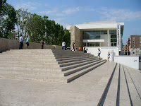
A few days ago I wrote about the ongoing controversy surrounding Richard Meier's Ara Pacis Museum in Rome. At the end of my entry, I made a comment about the previous building to house the Ara Pacis on that site, a Fascist-era construction dating from 1938. Thanks to the astute observations of my good friend and fellow New Haven architect, Kyle, I am now able to include a little more information about this first Ara Pacis pavilion.
The 1938 building was designed by architect Vittorio Ballio Morpurgo under the direction of Benito Mussolini, who had the Ara Pacis reconstructed and moved from the outskirts of Rome to its current location in the centro storico near the Mausoleum of Augustus. You can see a vintage postcard image of the building on this blog, and if you would like to see what the building looked like during World War II, when the Ara Pacis itself was sandbagged to protect it, click here!
Now that I have seen a photograph of the Ara Pacis' previous home, I think I appreciate the lightness and simplicity of Meier's building even more. I also question the Mayor's criticism of the new building, as the old one is also somewhat acontextual within its Baroque surroundings. In support of the new building, this article from the New York Times points out that one benefit to Meier's structure over the previous one is that it has helped to set the Ara Pacis free from its Fascist associations with Mussolini. This may or may not be true depending on your point of view on Modern architecture!
In the end, I will leave you to your own aesthetic judgement. But for me, I truly enjoyed Meier's simple and elegant building as a backdrop for the beautiful Ara Pacis.
Tuesday, May 27, 2008
Monday, May 26, 2008
Learning to Love Louis
"A great building must begin with the unmeasurable, must go through measurable means when it is being designed, and in the end must be unmeasurable." (Louis I. Kahn)
I mentioned Louis Kahn in my previous post. Though New Haven is lucky enough to have Kahn's first museum (Yale Art Gallery, 1953) and his last museum (Yale Center for British Art, 1974) sitting across the street from one another, I did not really have a mature appreciation for Kahn until my last year at Yale, when I had the privilege of visiting his Kimbell Art Museum in Fort Worth, Texas.
The architects among you may wonder why my initial hesitation about the great Louis Kahn. Throughout my education, many people had touted the wonders of Kahn's works, Kahn's skill with materials and natural lighting, and his ability to make Modern buildings that are respectful of the context of architectural history. But to tell you the truth, I just did not get it. Call it bad photography.
I trust that anyone who has ever been in a Kahn building will agree with me that photographs of his buildings, no matter how skilled the photographer, cannot begin to communicate the feeling of actually experiencing them. In the photographs I had seen of the Kimbell, for example, Kahn's famous light scoops at the top of each concrete vault appeared greenish and artificially lit, which is not at all the experience one has while actually inside the building. Even though I had been in New Haven's two Kahn buildings several times before my trip to Texas, the Kimbell Art Museum was an emotional experience unlike any other that I had experienced previously in any of Kahn's buildings. This emotional connection to the way the light entered the space through the building's famous vaults was not dissimilar to the feeling I would have again (on a completely different scale) upon visiting the Pantheon in Rome several years later.
Before I travelled to Fort Worth with my classmates in Deborah Berke's spring 2005 design studio, Susana Torre, one of my other Yale professors, told me that being at the Kimbell was like viewing someone's private art collection at their beautiful villa--it is scaled more like a home for art than a large institutional museum. After my visit, I would definitely have to agree with her. The building does seem more like a home than a museum, which only adds to the relaxing pleasure of viewing the art within.
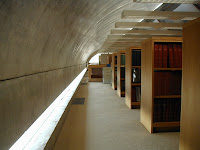
My classmates and I arrived a the Kimbell early in the morning before it was open to the public. In addition to the main public exhibition areas, our tour of the building took us into private loading and storage areas, offices, the auditorium, and, perhaps most interestingly, the library, which is naturally illuminated as well and sits on a second floor in one of the vaulted areas, just under the curved concrete ceiling.
Le Corbusier said that "architecture is the masterly, correct, and magnificent play of form in light," and it is clear that Kahn understood this. His filtering and directing of the natural light through the form of the vaulting and the screens is stunning, really. Almost in opposition to the light that in the Pantheon is heavy and thick, the natural light at the Kimbell seems weightless and airy--is it the light or the columns that hold the vaults off the ground?
I think seeing the Kimbell before it was open to the public and in the early morning when the light was direct yet gentle has perhaps skewed my memory of the building. But I think that is one of the things I like best about experiencing great architecture. Beyond the photographs and the reality is the memory, an idealized and perhaps nostalgic version of the truth. But in the memory, there are no crowds, there are no distractions, only the feeling--the emotion--that comes from experiencing a great and timeless work of architecture.
Competing for Attention
Yale's commencement ceremonies were today. Since we have a few friends graduating this semester from the Master of Architecture program at the Yale School of Architecture, Kim and I went to show our support. YSOA graduation usually takes placed in the 4th floor "pit" of the famous (or perhaps infamous, depending on your point of view) A+A building, a Brutalist structure designed by Paul Rudolph and completed in 1963.
This year, however, festivities were held in the sculpture courtyard of Louis Kahn's Yale Art Gallery, just across the street, as the A+A is currently being renovated and the Art History program is building an adjoining building immediately to the north of it. The renovation and addition to the A+A were designed by Charles Gwathmey of Gwathmey Siegel & Associates in New York City. The school has been under construction since the end of spring semester 2007, and construction will be completed this summer in time for students to return to the building for the fall semester 2008.
I am quite excited about the renovation of Rudolph's building, which I grew to love during my three years there for school. But the addition...well...not so much. Despite the best intentions of the architect, Yale University, and the YSOA under the leadership of Dean Robert A.M. Stern, there have been a number of critical rumblings in the New Haven architectural community since the renovation and addition were announced several years ago.
I saw Charles Gwathemey speak about the addition just as the designs were made public. The beginning of his lecture, before he showed images of the design, was quite inspiring. He spoke about the great responsibility and challenge that was inherent in the design problem, as the site sits immediately adjacent to Rudolph's building and across the street from two Louis Kahn buildings--the Yale Art Gallery, which I mentioned before, and the Yale Center for British Art. These three nearby building are arguably some of New Haven's greatest architectural gems, as well as world-class buildings in their own right. The A+A addition is not world-class.
The problem that is inherent in Gwathmey's design, I feel, is that it competes too much with Rudolph's original structure. This is not a general criticism of Gwathmey's work per se, as he is clearly a talented and successful designer who leads a well-known architectural practice. However, it is a strong criticism of his design solution in this situation. On the one hand, he speaks publicly about his respect for and deference to Rudolph and Kahn before him, while on the other, he presents a front-and-center design that is not good enough to supersede the A+A in architectural importance and too visually complex and formally gymnastic to defer to it.
Truthfully, though, I am less concerned about the jumble of forms that the Art History addition assembles along York Street than I am about the experience of Yale's future architecture students. One of the greatest aspects of having a design studio on the north side of the A+A, in addition to the great indirect northern light, were the incredible panoramic view of Yale's campus. Not that architecture students ever lose focus or have time to daydream, but if we did, the view out to so many Gothic towers and beautiful courtyards could certainly help get us past our designer's block! It is the loss of this spectacular view and this studio experience, which has unified generations of architecture students since the building first opened in 1963, that I find truly unfortunate.
Sunday, May 25, 2008
Peace Causes Unrest
I read an editorial the other day about the ongoing controversy surrounding the Ara Pacis Museum in Rome. The Museum was designed by Richard Meier to house the Ara Pacis, an Altar of Peace dating from 9 BC and the emperor Augustus. The building opened in 2006 and has apparently been a sore topic for some Romans since. The mayor of Rome has even suggested that it be torn down, his argument being that the building, a Modern structure, is incompatible with its surroundings.
Kim and I recently visited the Ara Pacis Museum while in Rome--it was one of our favorite buildings! We walked to the Museum after a morning of visiting the Vatican Museum, Sistine Chapel, and St. Peter's Basilica. Our leisurely walk took us across the Ponte Sant'Angelo and along the Lungotevere, the busy street that runs along the banks of the Tiber River. We welcomed our arrival to the Piazza in front of the Museum as a respite from the traffic, its cooling waterwall drowning out the sounds of the cars around us.
As an architect, I will be one of the first to acknowledge that some of Meier's details are a little bit funny. However, they did spend money on some important things, like mitered corners on the travertine walls. I felt that the museum was light, airy, and a perfectly suitable display case for the restored and reconstructed Ara Pacis. I do not quite know what the Mayor has in mind for a replacement, but my personal fear is that a building in a classical or traditional style could end up competing for attention with the beautiful Ara Pacis itself.
Call me a Modernist, but the simple lines and subdued palette of the building stood out in welcome contrast to the Baroque extravagance that permeates so much of Rome. Don't get me wrong, architecture in Rome in general is exceptionally beautiful. However, sometimes even too much of a good thing can be overwhelming. Meier's building could rightfully be considered a critique of Rome's classical environment, but in my eyes, it is such a visually subdued and simply elegant construction that it is by no means trying to compete with its surroundings.
In light of the controversy I mentioned above, I did discover one detail that struck me as odd when I read Wikipedia's entry on the Ara Pacis. In 1938, Benito Mussolini had the Ara Pacis moved from the outskirts of the city to its present site and commissioned a building to house it. Though I was not able to find any photographs of the Ara Pacis' previous home, judging by some of the other monumental architecture constructed around Rome during Mussolini's reign, Meier's Museum may actually be much more respectful of its context than the previous building anyway!
Friday, May 23, 2008
Wait! Hold it, right there!
We have all seen them: silly photographs of smiling tourists "holding up" the Leaning Tower of Pisa. The end result tends to look like this, or even this. But have you ever wondered what people actually look like while they're in the throes of posing for this souvenir photograph?
When you arrive in Pisa, what's really strange (that is, once you have gotten past the seemingly impossible angle that the centuries-old masonry tower is leaning) is the inordinate amount of people standing around "holding up" air for the sake of this legendary photograph. Truthfully, they may be a bit more fun to look at than the skewed Campanile as they do their "no wait, a little more to the left" dance, occasionally in tandem with another person trying to topple the tower from the other direction.
I was not in Pisa long, really just long enough to see that, believe it or not, there is a tower there that leans! And I did not end up climbing the Campanile as I had hoped because of the admission fee. But I did spend some time in the beautiful Cathedral and the Baptistry. I actually find it a bit sad that the Campanile gets all the attention as a result of its faulty foundations, while the other two buildings, quite stunning in their own right, seem to lurk in the shadows.
Thursday, May 22, 2008
Inspiration from the Oculus
Kim and I just returned last week from Italy. I was going to be there on business, so the two of decided to go a little early to spend some time together in Rome for our anniversary. This was the first time in Italy for both of us, so we vowed to make the most of our days together by seeing as much as possible.
Well, that and the gelato...
Rome was, well, amazing! Especially for me. To see so much of the art and architecture I had previously only studied in school or seen in books was truly a great privilege. But one work of architecture stood out to me more than all the others: the Pantheon.
We visited the Pantheon for the first time in the mid-afternoon of our first day in Rome, when the sun was still high in the sky. After dropping off our luggage at our hotel near the Vatican, we took the subway downtown and wove our way from the station through the centro storico's narrow and picturesque streets slowly toward the Pantheon, casually taking in some churches and piazzas along the way.
Nothing can really prepare you for the experience of entering the Pantheon for the first time. The volume of space sheltered by its famous coffered dome is immense, and the interior seems much bigger than you might imagine upon seeing the building from the outside. And in a surreal and painterly way, the sunlight really does stream down from the oculus in a singular, powerful beam, cutting through an atmosphere thick with history to illuminate pristine architectural details almost 2000 years old.
It is almost unimaginable that a building of the Pantheon's age can be in such excellent condition. Seeing the Pantheon was the first time in my life that I was able to relate to ancient Roman architecture as something real and tangible, not just an outdated concept to be studied in books.
We sat for quite a while in the Pantheon that first day while I tried to meagerly capture the majesty of the space with my little digital point-and-shoot. It can't be done.
I enjoyed my time in Rome, and I'm glad I saw the the Forum, the Coliseum, the Vatican, and many beautiful churches. But, truthfully, I would have traded them all for a few days in the Pantheon, watching the sun rise and set through the oculus.
Rome would have been worth it if only for the Pantheon.
Well, that and the gelato...
Subscribe to:
Posts (Atom)