Tuesday, December 23, 2008

I Passed My First ARE!

Today in the mail I (finally!) received the score for my first ARE (Site Planning & Design), which I took back in October.  I am pleased to report that I passed!

According to NCARB's website, Prometric recently experienced some scoring delays related to the new ARE 4.0.  I am hoping these kinks are worked out now and it will not take more than two months to grade each of the other tests.  Perhaps by the time I take my fourth test in mid-January, I will know whether I passed the other two I have already taken.

Before I started taking my tests, several of my recently-licensed friends advised me to set a pretty steady test-taking schedule and stick to it.  I have been successful so far in sticking to my one-test-a-month schedule so far, and with continued perseverance (and passing grades!) I will complete all my tests by April!

Tuesday, December 16, 2008

Three Down, Four to Go

I just got back from taking my third registration exam: Schematic Design. The test material was not really difficult, but the time constraints made it feel a bit difficult. In the first of two exercises, I had one hour to lay out the interior partitions and furniture for a suite of offices. In the second, I had four hours to lay out the schematic plans for a two-story building given a specific program and code requirements. Neither of these exercises created great architecture, but I hope that I was able to fulfill the program and code requirements sufficiently. There were certainly some things I wished I could have clarified or tweaked, but at a some point, you are just beyond the point of no return! I know I could have been more clear on a few components of each layout, but I am hoping that I made only minor, non-critical errors in the exam.

As with the other two exams I have already taken, I will reserve judgment on the level of difficulty of the test until I receive my scores; however, I do feel optimistic and hopeful that this particular exam went pretty smoothly.

Incidentally, I have not yet received any scores from my other two exams, even though I took the first one two months ago. Maybe I'll get a few passing scores for Christmas!

Monday, December 15, 2008

This Day in History: Feliz Aniversario!

If you have ever met me, you probably figured out that I love Modern architecture.  If you know me well, then you probably know that I love Latin American Modern architecture in particular.  If you know me really well, then you have probably heard me talk about my admiration for the great Brazilian Modernist architect Oscar Niemeyer.  And if you know me really, really well, then you know that my little black dachshund, Oscar, is named, not after the famous hot dog brand, but after Mr. Niemeyer himself!

OK, so I admit that I am a little bit of a Latino-phile and Modernist wannabe, but with good reason:  today, Oscar Niemeyer turns 101 years old!  At a century-plus-one and still practicing, Niemeyer is the last living of the great Modern architects.  What an amazing life, what an amazing career, what an amazing legacy!

In school, I took every research paper opportunity possible to write about Niemeyer and his architecture, and at work last year, I applied for Pickard Chilton's first annual architectural travel award--my proposal to spend two weeks in Brazil researching Modern architecture was overwhelmed by Niemeyer buildings.  Somewhere in that proposal was also the glimmer of hope that I might be able to meet Mr. Niemeyer while in Brazil, which has been a long-time dream of mine.  (And somewhere even deeper, on the outside edge of possibility, would be having the opportunity to meet him when Kim and I travel to Brazil to complete the adoption of our two children!  You can read about this adventure on our adoption blog.)

I know someday I will have the opportunity to visit Brazil and to experience some of Mr. Niemeyer's buildings first-hand, but I also know that I have to be realistic that my dream of meeting him becomes less and less probable with each passing year.

So, in case I never get to meet you, Mr. Niemeyer, congratulations on your 101st birthday!  Congratulations on your long and exuberant life and a on your long and distinguished architectural career.  Thank you for your incredible and indispensable contribution to the legacy of Modern architecture in the world, and thank you for your consistent inspiration to me throughout my architectural studies and career.

Feliz Aniversario, Senhor Niemeyer!  Muitas felicitações!

Sunday, November 30, 2008

This Day in History: Birthday Buddies

Today is my 29th birthday. Today is also the 500th anniversary of the birth of Italian Renaissance architect Andrea Palladio (d. 19 August 1580).

Now, if an architect wanted to share a birthday with another architect, Palladio's not a shabby option.  He is one of the most well-known and influential architects of the Renaissance in Italy and is most famous for his projects in and around Venice, including the church of Il Redentore and the Villa Rotunda.

In honor of Palladio's 500th anniversary, I have decided to re-read his "Four Books On Architecture," which was first published in 1570.  I read this book for the first time in a class on Classical architecture at Georgia Tech, and it is considered a seminal work of architectural history and theory.

Happy birthday, Palladio!

Saturday, November 29, 2008

This Day in History: Remembering Jørn Utzon

"I like to be on the edge of the possible." (Jørn Utzon)
Danish architect Jørn Utzon (b. 19 April 1918) died today at the age of 90.  Utzon, who is most famous for his design for the Sydney Opera House, won the prestigious Pritzker Prize in 2003.  In their award citation, the Pritzker jury commented that Utzon "proves that the marvelous and seemingly impossible in architecture can be achieved.  He has always been ahead of his time.  He rightly joins the handful of Modernists who have shaped the past century with buildings of timeless and enduring quality."

Although I have not visited his Opera House in person, I did have the opportunity to visit Utzon's Bagsvaerd Kirke (c. 1976) back in the summer of 2006 when I was in Copenhagen for a few days on business.  I really love sacred spaces and I have a soft heart for well-designed, beautiful, and inspiring religions architecture, so I was not disappointment with my visit to this wonderful church.

In spite of the fact that the Sydney Opera House is one of the most recognizable and iconic buildings in the entire world for both architects and non-architects alike, Utzon is not a designer who is studied much in school or talked about often in the profession.  Before my trip to Denmark, I was only vaguely familiar with the Bagsvaerd Church.  I had seen in passing the plan and section of the building.  These drawings illustrate the basic concept of the free-flowing, lyrical ceiling floating within a fairly straight-forward, boxy shell.

The exterior of the building is very simple with an almost industrial in feeling.  The walls are made up of white concrete and white glazed tiles; the roof is corrugated aluminum.  Though austere, the building possesses that simple and elegant warmth prevalent in so much Scandinavian architecture.

The building comprises a number of courtyards, classrooms, offices, a chapel, and a soaring sanctuary space.  The sanctuary is by far the real jewel of the building.  Though relatively small and compact in plan, the ceiling of the sanctuary is quite high, with clerestory lighting along the rear of the vault.  In a design sketch of the ceiling, Utzon showed his inspiration as coming from the clouds.  The board-forming of the white concrete vaulting give the ceiling a natural feeling consummate with this inspiration.  The simple pine furniture in the sanctuary was designed by Utzon's son Jan and the colorful textiles were designed by his daughter Lin.  Behind the white terrazzo altar, a triangular masonry screen separates the main sanctuary from a small prayer chapel, while extensive sky lighting in the corridors adjacent to the sanctuary and from the vault above fill the building with abundant natural light.


Tuesday, November 18, 2008

Two Down, Five to Go

Today I took my second A.R.E.: Structural Systems. I must say, it was much better than I had expected. Going into the test, I was thinking "bloodbath," but I am cautiously optimistic that I sustained only a few minor flesh wounds in this battle! I certainly was not over-prepared for the test, but I definitely was not under-prepared either.

Now it is a matter of waiting for my score. Incidentally, I have not yet received my score from Site Planning & Design, which I took four weeks ago. While I wait for the scores from both of these tests, I am going to prepare for my next test (Schematic Design) which I scheduled for December 16th. This meets my goal of completing 3 tests before Christmas, and at the rate of 1 per month, I am well underway to being finished with all 7 of my tests by next April!

Wednesday, October 22, 2008

Site Planning & Design

Well, I did it!  Yesterday I took my first ARE:  "Site Planning & Design."  This was the first of seven tests I will have to take in order to achieving my architectural registration.  Though I feel pretty comfortable with my performance, I will have to wait a few weeks until I receive my official score (pass or fail) in the mail.

The test included 65 multiple-choice questions over 1.5 hours and two graphic/drawing components over 2 hours.  I felt adequately-prepared by reading a study guide, taking several study tests, and by practicing with the drafting software (which is quite a bit different from AutoCAD).

Next on the docket:  I'm going to try to take "Structural Systems" and "Schematic Design" before Christmas!

Saturday, October 11, 2008

New Favorite

"Design is not making beauty. Beauty emerges from selection, affinities, integration, love." (Louis Kahn)

Back in July, my friend James asked me at a dinner party, "what's so special about Louis Kahn."  James is not an architect, but he was a high school student at Philips Exeter Academy in Exeter, New Hampshire, where he remembers architects coming from all over the see the Academy's Kahn-designed library.

Every now and then, architects like to go on a good architectural pilgrimage, and our conversation got me thinking about taking a little trip up to Exeter, which is only about a three-hour drive from New Haven.  After a little bit of planning, last Sunday after church, four of my friends and I piled into my car and drove to Exeter on a beautiful New England fall afternoon.  (Apparently, five grown men in one Prius is a bit much!)  James was the only non-architect of the group.

The Library at Exeter is the fourth Kahn-designed building I have visited.  The others are the Yale Art Gallery and Yale Center for British Art, both in New Haven, and the Kimbell Art Museum in Fort Worth.  (I am ashamed to say that, though I went to high school in eastern Pennsylvania and lived in Philadelphia for a summer, I have not yet visited the Richards Medical Research Laboratory in Philadelphia.)  Though each of these buildings is quite amazing in its own respect, and it is a little hard to compare three art museums to a library, I think that the Exeter Library is probably my favorite.

One of the things that struck me most about the Library was that it feels both monumental and intimate at the same time.  This is especially true on the interior, where the central atrium feels more like a large living room than a small-atrium.  And at the same time the building has a large atrium space, it also has small and intimate study and reading areas, including one are with a fireplace.  I suppose this combination of both monumentality and intimacy should not have surprised me too much as I can recall a similar reaction to the Kimbell Art Museum in Fort Worth a couple of years ago.  Kahn's work is monumental, not in a size sense, but in the sense that it feel like it has always been present and will always remain present in the world.  His work is rational, Classical, Modern.

Of the Kahn buildings I have visited, the Exeter Library quite possibly feels the most classical.  Kahn was obsessed with the idea of the architectural ruin, and he tried in many ways to recreate in a Modern way the architecture of the ancient world.  Having just been to Rome this past May, seeing the Library for the first time conjured up images of the ruins at the Forum Romanum and the Paletine.  Most spectacular in this sense is his use of brick on the exterior of the building, where he uses flat arches at each double-height window as the transition point for the piers to narrow:  because of this most delicate detail, when you first look at the building, you hardly notice that that the piers are narrowing and the windows are getting larger toward the top of the building.

One peculiar thing I noticed while visiting the library is that each side of the square building has eight bays and nine piers.  This surprised me as Classical architecture generally has "even columns, odd bays," which gives the building a clear center and point of entry or access.  This is evident in most refined Classical buildings of the ancient world.  Though this confused me at first, given Kahn's architecture's affinity to the Classical, my friend Andrew pointed out that this removes any sense of central entry from the building, allowing the bi-laterally symmetrical building to be seen entirely in the round, and forcing the visitor to walk around the arcade at the base of the building until finding the entry.  We also noted that none of the paths on the campus approached the building on-center with one of the facades, but at the corners.  The building, though the same on each facade, is meant to be viewed as a three-dimensional object in space.

I suppose I could continue to write about the Library for quite some time:  each piece of Kahn's architecture is a world unto itself.  Just suffice it to say that I had a really great time visiting the Exeter Library.  Not only was it nice to have a chance to visit a beautiful work of architecture, but it was a really wonderful opportunity to spend the day with a great group of good friends. I am especially happy that James was able to come with us to visit his alma mater with renewed interest in the building, and I really enjoyed the comments he left with his photos on Facebook:  "I never paid much attention to the library's architecture when I was a student.  Now that I was deliberately focusing on it, I must admit it's a very cool building.  It's a large space, but it feels very intimate, and there's a pleasing unity to the design.  The grand starkness of the structure of the structure makes the library look like an alien ruin in Halo."

Since I have never played Halo, I cannot speak to the quality of the architecture as an alien ruin!  But I must say that James perhaps said it better than any of the architects in his reaction to seeing the building.  Kahn's architecture is all about unity, and it is perhaps the grand starkness of his work that makes it most sublime.

Friday, September 26, 2008

ARE You Nervous?

Today I did it!  I registered for my first ARE (Architect Registration Exam)!

After seven years of school and three-and-a-half years of full-time employment, it has been a long time coming.  So, on October 21st at 12:30 in the afternoon I will sit to take the the first of seven registration exams:  "Site Planning & Design."  As I am still completing some final IDP (Intern Development Program) requirements toward licensing, I will be taking my registration exams for the state of Massachusetts, which (unlike Connecticut) allows candidates to sit for the AREs before finishing IDP.  This will hopefully allow me to complete both in a timely manner.  My goal is to be licensed sometime next spring, or before Kim and I bring our children home from Brazil, whichever comes first.  (Hopefully the kids come home first!)

Yikes, I had better get crackin'.

Thursday, September 25, 2008

This Day in History: If it Ain't Baroque

Today is the 409th anniversary of the birth of the Italian Baroque architect Francisco Borromini (September 25, 1599).

While Kim and I were in Rome this past May, we had the opportunity to visit a couple of Borromini's buildings, and I must say I was quite pleased.  Generally, I am a bit turned off by Baroque architecture as I find that it is simply too much of too much.  But Borromini's work, though intricate, possessed a sort of elegant simplicity which really spoke to me.  His work did not reek of the overwrought detailing so prevalent in much Baroque architecture.

Borromini's small church San Carlo alle Quattro Fontane (or San Carlino, 1634-1637) was one of my favorite churches that we visited in Rome.  (Please keep in mind there are a lot of churches to visit in Rome!) The church's white, oval-shaped dome is stunning, really, with its complex coffering pattern of simple geometries. And the dome's skylit lantern and several small windows provide more than enough light on a sunny day (of which there seem to be many in Rome) to fill the lightly-colored space with a beautiful, clean light.  The beautiful chapel also serves as a quiet respite at the corner of a narrow, busy crossroads, while its intimate scale and beautiful architecture made it feel to me like one of the most sacred spaces I have ever been in.

Tuesday, September 23, 2008

People Who Live in Glass Houses

"Architecture is the art of how to waste space." (Philip Johnson)

Tickets went on sale this morning at 9:00 to visit Philip Johnson's Glass House and estate in New Canaan, Connecticut, during the 2009 season (May-October). Though I intended to visit the house in 2008, tickets sold out quickly when they went on sale last year. Having learned my lesson from that experience, this time I was not going to take any chances.  I was ready this morning with credit card in hand before 9:00 to buy tickets for myself, Kim, and three of our friends. It seemed like almost instantly weekends in May started selling out, so in order to find five tickets together, I had to look all the way ahead to July 11th!  That was a real surprise!

Who spends $45 a head 9.5 months in advance to buy tickets for a two hour tour of a house!?  A very cool, modern house, but a house none-the-less!?  Why, it could only be a group of architecture dorks and their loving and ever-so-supportive wives!  Thanks, loving and supportive wives, for putting up with our shenanigans!

Sunday, September 21, 2008

Half-Way 'Round the World

This past week, I had the amazing opportunity to travel to Kuala Lumpur, Malaysia on business. Although I learned several years ago that business travel and leisure travel are not really synonymous, I have had some pretty amazing opportunities to travel while working at Pickard Chilton, including trips to Canada, Denmark, Italy, a number of cities around the United States, and, now, Malaysia. Throughout my business travels, my attitude has always been, "well, I may never get back here again, so why don't I make the most of it."

Though this trip was quite quick and I only had a few spare hours of time to myself, I feel privileged to have had an opportunity that most people in the world will never have. In about four hours one evening, I walked around downtown KL, visited a large craft market as well as one of the largest malls I have ever been to, bought some souvenirs for Kim, went to the top of the Menara KL observation tower, listened to a performance on traditional Malaysian instruments, ended up in China Town, rode the subway back to my hotel, and laid on the ground in front of the Petronas Towers to take a picture of a large group of British teenagers. Whew!

One of the most exciting parts of the trip was being able to see the Petronas Towers, which, although not the tallest buildings in the world anymore, are still the tallest twin towers. The towers were designed by Jon Pickard, one of the principals of Pickard Chilton, while he was working with Cesar Pelli, and so I feel especially privileged to have had the opportunity to see them first-hand.

Though the towers are quite beautiful during the daytime, they are absolutely stunning at during the nighttime. At night, the multi-faceted Islamic-inspired stainless-steel-clad towers shimmer and shine like jewels in the powerful spotlights. They are almost surreal as they sit above KLCC Park. They seem both massive and delicate at the same time, and appear close enough that you could reach out and touch them through the thick, humid, tropical air.

Tuesday, September 9, 2008

LEED On

This summer, Pickard Chilton announced a new initiative to have all of our designers become Accredited Professionals in the Leadership in Energy and Environmental Design (LEED) program by the fall. After a few nervous weeks of reading and studying, I passed the exam earlier today and am now officially a LEED AP!

Hopefully this past month of preparing for my LEED exam will help me get in the habit of studying for my next big professional step: licensing!

AREs (all 7 of you) here I come!

Thursday, August 21, 2008

This Day in History: The Powers of 10

"Choose your corner, pick away at it carefully, intensely and to the best of your ability and that way you might change the world." (Charles Eames)
Today marks the 30th anniversary of the death of Charles Eames and the 20th anniversary of the death of his wife Ray. This iconic husband-and-wife team made incredible contributions during the 20th century to Modern architecture and design. Their vast body of work includes art, architecture, furniture design, industrial design, graphic design, textile design, photography, film-making, and toy-making to name a few!

Charles died in 1978 at the age of 71--Ray died exactly ten years later in 1988 at the age of 75. Their impressive legacy continues to live on.

Disappointing Details: So Many Glazing Types, So Little Façade

"God is in the details." (Ludwig Mies van der Rohe)
To complement my new "Distinguishing Details" series, I though it would be appropriate to also start a series of posts on "Disappointing Details." Disappointing Details in my mind range from the well-intended but badly-executed to the just plain bad! Sometimes disappointing details are overdesigned and sometimes they are underdesigned. Either way, they can (and do) take away from the power of the overall design.

Good buildings can have OK details, but great buildings must have exceptional details.

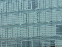
One aspect of good detailing is good material selection. These images are of the new facility for New Haven's Cooperative Arts and Humanities Magnet High School being built downtown along College Street between Crown and George Streets. The building was designed by local architect Cesar Pelli (Pelli Clarke Pelli) and appears to be nearing completion of the exterior.

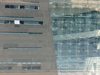
On the building, the designers have used at least three different patterns of ceramic fritted glass. Each pattern separately and in isolated usage would be fine, but the entire College Street elevation is covered with conflicting patterns. This creates some odd conditions where, for instance, tree leaves meet horizontal stripes! To my eye, the building seems to be suffering from too many different glazing strategies competing for attention at once.

Seems like someone couldn't see the forest for the trees!

Sunday, August 17, 2008

This Day in History: Michael Phelps Takes Gold and Gold and Gold and Gold and Gold and Gold and Gold and Gold!

Today in Beijing, American swimmer Michael Phelps surpassed Mark Spitz to take the title of the athlete with the most gold medals won in a single Olympic Game. Including one very exciting finish only 1/100 of a second ahead of second place, he has won 8 gold medals in one week!

OK, so this post is not exactly architectural, but I have been glued to the TV and his races this year, and, believe it or not, life is not only about architecture! If it is any consolation, he accomplished this formidable task in the Water Cube, which I wrote about a few days ago.

Congratulations Michael Phelps!

Saturday, August 16, 2008

Distinguishing Details: Curtain Walls in Copenhagen

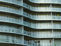
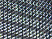
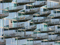
In June of 2006, I had the opportunity to travel to Copenhagen on business. After my meetings were over, I stayed in Denmark for two additional days and guided myself on a whirlwind tour of the area architecture (including even a brief trip to Malmö, Sweden, to see Santiago Calatrava's Turning Torso building). It was exciting for me to be able to visit Copenhagen not only because of the great heritage of Danish architecture and design, but also because of my own Danish roots (on my Mom's side). I was not disappointed: Copenhagen is a wonderful city full of beautiful traditional architecture, classic Modern architecture, and innovative new architecture. Here are some facade details from buildings I saw on my trip.
SAS Hotel, (c) J.FulltonTivoli Concert Hall Rotunda, (c) J.FulltonGemini Residence, (c) J.FulltonRoyal LibraryNordlyset Residences, (c) J.FulltonFerring IPC, (c) J.FulltonTietgenkollegiet, (c) J.FulltonVM HousingBuilding in Ørestad, (c) J.FulltonBuilding in Ørestad, (c) J.Fullton