Monday, March 23, 2009

Seven Down, Zero to Go

Today I took my seventh (and last!) ARE: Programming, Planning & Practice.  I felt pretty comfortable with the material covered so I hope I did well on the exam.  As always, though, I just have to wait for the score.

And speaking of scores, when I got home from the testing center, I was happy to see a letter from NCARB informing me I had passed my fifth exam (Building Systems), which I took back in mid-February!  This leaves only my score for the final two exams up in the air.

Pending a passing score for these last two exams, I expect to be able to finish all of my IDP requirements in the next month or two, at which point I will be able to apply for my license!  It definitely feels good to be in the home stretch for this particular step in my professional development.  After all, I have only been studying and practicing architecture for the past 11 years of my life!

Monday, March 16, 2009

Light in Islamic Architecture

Light is an important element in all architecture. Le Corbusier said, “Architecture is the learned game, correct and magnificent, of forms assembled in the light.” Louis Kahn said, “I sense Light as the giver of all presences, and material as spent light. What Light makes casts a shadow and the shadow belongs to Light.” Without light, we cannot see form, color, or texture. Light—natural light—is what gives character to architecture.

In Islam, light symbolizes God. The Qur’an states, “God is the light of the heavens and the earth.” Light in Islamic architecture, then, is used to symbolically represent God’s presence in a space while emphasizing the color and texture of decorative elements, materials, and architectural articulation.

One particularly intriguing mediator of light and space in Islamic architecture is the screen. The screen in traditional Islamic architecture is used to filter harsh sunlight, and it was developed out of necessity in the hot, harsh-sun climates of the Middle East and Asia. Thought sometimes they are made of wood, many times these intricately patterned screens are carved out of stone. Some of the most beautiful examples of the type of Islamic stone screen can be found at Fetehpur Sikri in Agra, India.

In architecture, screens tend to blur the distinction between interior and exterior space. In Islamic architecture, they are used to mediate the direct sunlight by casting intricate shadow patterns in the interior space. These patterns, which I will talk about in my next post, are very important in the art and architecture of Islam.

The use of screens in Islamic architecture is not confined to the past. Architects have continued to reinterpret the concept of “screen” in new and innovative ways through the 20th century and even today. For example, Jean Nouvel’s Arab World Institute (1987) in Paris uses an operable screen of camera-type apertures to control sunlight. Other interesting recent examples of Islamic screens can be seen on the National Mosque (1965) in Kuala Lumpur, Malaysia, and the Museum of Islamic Art (2008) in Doha, Qatar.

Sunday, March 15, 2009

Water in Islamic Architecture

In Islam, water is seen as life-giving, sustaining, and purifying. The Qur’an states, “from water every living creature was created.”

Water is used in Islamic architecture for several basic reasons. First, it is used practically to provide cooling in hot, dry climates (e.g. the courtyard fountains and pools typically found in the vernacular architecture of the Middle East and North Africa, the origin of Islam). Second, it is used aesthetically to emphasize visual axes, reflect the surrounding environment, and visually multiply the adjacent architecture and its decorative detailing (e.g. the reflecting pools and watercourses at the Alhambra and Generalife in Granada, Spain). Third, it is used symbolically to represent the life-giving, sustaining, and purifying aspects of water mentioned in the Qur’an (e.g. the ablution fountains found traditionally in the central courts of mosques).

Water is an important component of traditional Islamic gardens and courtyards. In the Qur’an, the “garden” is used to represent the paradise promised to believers. One very particular type of Islamic garden related specifically to this concept is the so-called “Paradise Garden.” The word “paradise” comes from the Persian words pairi, meaning “around,” and daeza, meaning, “wall.” Together, these words create a reference to the fact that early Middle Eastern gardens were enclosed, masonry-walled precincts set aside from the wilderness of nature and used for cultivation in the desert.
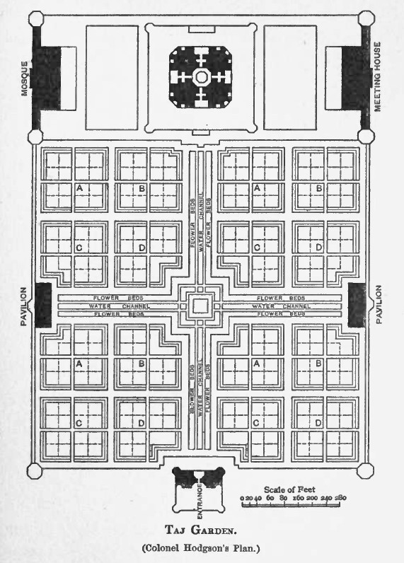
The traditional layout of the Paradise Garden is rectilinear with a central pool or fountain and four extending watercourses. This quadripartite garden is also known as a chahar bagh or charbagh, a term which means “four gardens” in Persian. The central fountain symbolizes the origin and sustainer of life and the watercourses represent the four rivers of the Garden of Eden. In addition to their symbolic function, the fountain and watercourses also served the very practical purpose of irrigating the garden. As a general rule, the Paradise Garden is very formal and manicured. Perhaps the most famous Islamic Paradise Garden known to westerners is the garden at the Taj Mahal in Agra, India. At the Taj Mahal, each of the four quadrant gardens is divided geometrically into sixteen planting beds.

Although the Paradise Garden form is prevalent in Islam, it should not be taken as the only type of Islamic garden. Regardless of the ultimate form, there are several general themes that are common throughout the design of gardens in Islam: water is generally a unifying feature, shade is achieved through planting and architecture, and there is a balanced play between formal and informal planting arrangements.

With respect to water in particular, there are several important aspects of its design worth noting and which are helpful in evaluating its specific use in Islamic gardens:

type – fountain (dynamic) v. pool (static),
character – moving (dynamic) v. still (static),
depth – deep (dark, used to reflect its surroundings) v. shallow (light, used to illuminate its intricately-patterned, tiled basin),
form – linear (marking an axis) v. compact (marking a point).

Cultural Context

At work we are entering a design competition for a hotel in the Middle East. Even though it is sometimes a bit of post-rationalization for our design concepts, we often research information about the cultural context for a specific site. (I am actually quite interested in the influence of cultural context on Modern architecture. I only wish it was not always a post-rationalization!) Frequently this research means looking at the vernacular architecture of the region and any particularly noteworthy works of architecture based in the local culture.

This week I was asked by the team working on the project to do a little research on Islamic architecture, focusing specifically on the use of water in traditional Islamic design. I have really enjoyed traditional Islamic architecture ever since I did a research paper on Islamic gardens when I was in school at Georgia Tech, so this assignment was right up my alley. I find Islamic architecture incredibly beautiful aesthetically, especially the use of geometry, order, patterning, and color at all levels of the design. It is intricate yet simple, which is a pretty amazing thing to balance. (Unlike, say, Baroque architecture, which is intricate yet over the top!) Someday I would love to have the opportunity to visit first-hand some of the incredible traditional works of architecture in the Middle East, Africa, and Asia.

I really enjoyed refreshing my memory this week about Islamic architecture and gardens and looking at photographs of some pretty incredible works of architecture. After putting together a “cheat sheet” outline of concepts for the team, I decided it might be nice to write about some of what I researched on this blog. I think what I learned is a bit long for one blog post, so the next few articles will be about a specific aspect of traditional Islamic design that I find to be particularly interesting.

Saturday, March 7, 2009

Parking

"The parking garage is a peculiar twentieth-century phenomenon. The one in New Haven comes from the design of throughways....I wanted to make a building which said it dealt with cars and movement. I wanted there to be no doubt that this is a parking garage." (Paul Rudolph)
I have a strange architectural affinity for parking garages.  I suppose I love their simplicity and utility and the fact that they are, unlike most multi-story structures, basically a continuous surface from bottom to top--a combination of folds and ramps and decks and spirals.

While studying at Yale, I took a class called "Photography for Architects" in which we learned some basic SLR photography techniques, developed black-and-white film, and printed black-and-white photographs in the darkroom.  For our final project that semester, we were asked to pick a theme on which to build a collection of images, and I chose to photograph several parking garages around New Haven:  the Coliseum (demolished 2007), the Air Rights Garage, the Crown Street Garage, and the Temple Street Garage.  My photographs at the time attempted to focus not only on the parking garage as form in light and shadow, but also also on their upper decks as a sort of urban landscape, populated with stair towers, light fixtures, cars, and, perhaps most interestingly, the tops of the surrounding buildings, ungrounded and without context.

One of my favorites is the Temple Street Parking Garage, designed by Paul Rudolph and completed in 1963.  I love it because it is monumental, exuberant, retro, "cartoony," and "designy."  Sometimes I think it looks as if it was not built by humans but by some colony of giant insects--or perhaps it emerged out of some strange geologic event which left it standing after all the soil around it was eroded by water over the course of a million years.  The garage's slightly anamorphic stair and elevator towers peek out of the upper deck like sentinels guarding the city beyond, lit by their strange concrete light-pole companions and distinguished by their bright red and orange tile work--the choice of colors a product of 1960s design trends no doubt!  (The strange residential sun room-like backpacks and tangle of exposed electrical conduit running along the tiles are, I am certain, not original to the structure.)

I recently decided to stop back by the Temple Street Garage to try my eye at some photography with our new DSLR.  Last time I shot the garage, I was shooting black-and-white film.  But now, using digital photography and the magic of Photoshop, I was able to process these new photos to emphasize the vibrant color of the tile work on the stair towers, which I have done by using the channel mixer to remove the color from the remainder of the photograph.


More Kahn

I thought I would post a few more images from my photo shoot last week with Ken.  Like those that I posted earlier, these photos are from the Yale Art Gallery and the Yale Center for British Art and they were contenders for the architectural photography contest I entered last week.

Enjoy!
Yale Art Gallery

Yale Center for British Art


This is the view of the Yale Art Gallery's Swartwout Building
from the 4th floor of the British Art Center--I love this view!

Friday, March 6, 2009

Six Down, One to Go

Yesterday I took my sixth ARE:  Construction Documents and Services.  The multiple choice portion of the test was quite difficult, so I am not sure how confident to feel with my performance.  I studied quite a lot for the exam, but I think there were some nuances of contractual issues that I should have brushed up on a little more.  I hope they will not leave me hanging too long waiting for my score!

I also scheduled my last exam (Programming, Planning, and Practice) for later on in March.  I am pretty tired of taking tests so I decided just to power through studying for it and get 'em done!

Monday, March 2, 2009

Kahn-test

On Saturday, my photographer friend Ken (who blogs here) and I went downtown to do a little photography.  Ken and I went to photograph together a few weeks ago for fun, but this time I wanted to take some photos for an architectural photography competition sponsored by AIA St. Louis.  I asked Ken if he would like to join me and he jumped at the opportunity to come and try out some of his new equipment.

It was a beautiful day for a photo-outing and we spent most of our morning in the Yale Art Gallery and the Yale Center for British Art, two wonderful Modern buildings designed by architect Louis Kahn.  I have always loved the Yale Art Gallery and British Art Center being across the street from each other in New Haven, as they were Kahn's first and last musuems respectively--the latter completed posthumously.

Although we walked around town to some other sites, I ended up deciding to only submit photos from the two galleries.  Each competition entry could include up to five separate images, which I have included below for your viewing pleasure.  The competition postmark deadline was today, and I mailed my CD of images this morning.

So, what do you think?  Are any of these winners!?

"Kahn's Window"

"Kahn's Doorway"
(Ken's version of this photo is here.  Take notice of the "missing" fire extinguisher and alarm in my submission.  Ahh, the miracle of Photoshop!)

"Kahn at Eleven"

"Kahn's Vertigo"

"Kahn Descending"