Thursday, August 21, 2008

This Day in History: The Powers of 10

"Choose your corner, pick away at it carefully, intensely and to the best of your ability and that way you might change the world." (Charles Eames)
Today marks the 30th anniversary of the death of Charles Eames and the 20th anniversary of the death of his wife Ray. This iconic husband-and-wife team made incredible contributions during the 20th century to Modern architecture and design. Their vast body of work includes art, architecture, furniture design, industrial design, graphic design, textile design, photography, film-making, and toy-making to name a few!

Charles died in 1978 at the age of 71--Ray died exactly ten years later in 1988 at the age of 75. Their impressive legacy continues to live on.

Disappointing Details: So Many Glazing Types, So Little Façade

"God is in the details." (Ludwig Mies van der Rohe)
To complement my new "Distinguishing Details" series, I though it would be appropriate to also start a series of posts on "Disappointing Details." Disappointing Details in my mind range from the well-intended but badly-executed to the just plain bad! Sometimes disappointing details are overdesigned and sometimes they are underdesigned. Either way, they can (and do) take away from the power of the overall design.

Good buildings can have OK details, but great buildings must have exceptional details.

One aspect of good detailing is good material selection. These images are of the new facility for New Haven's Cooperative Arts and Humanities Magnet High School being built downtown along College Street between Crown and George Streets. The building was designed by local architect Cesar Pelli (Pelli Clarke Pelli) and appears to be nearing completion of the exterior.

On the building, the designers have used at least three different patterns of ceramic fritted glass. Each pattern separately and in isolated usage would be fine, but the entire College Street elevation is covered with conflicting patterns. This creates some odd conditions where, for instance, tree leaves meet horizontal stripes! To my eye, the building seems to be suffering from too many different glazing strategies competing for attention at once.

Seems like someone couldn't see the forest for the trees!

Sunday, August 17, 2008

This Day in History: Michael Phelps Takes Gold and Gold and Gold and Gold and Gold and Gold and Gold and Gold!

Today in Beijing, American swimmer Michael Phelps surpassed Mark Spitz to take the title of the athlete with the most gold medals won in a single Olympic Game. Including one very exciting finish only 1/100 of a second ahead of second place, he has won 8 gold medals in one week!

OK, so this post is not exactly architectural, but I have been glued to the TV and his races this year, and, believe it or not, life is not only about architecture! If it is any consolation, he accomplished this formidable task in the Water Cube, which I wrote about a few days ago.

Congratulations Michael Phelps!

Saturday, August 16, 2008

Distinguishing Details: Curtain Walls in Copenhagen

In June of 2006, I had the opportunity to travel to Copenhagen on business. After my meetings were over, I stayed in Denmark for two additional days and guided myself on a whirlwind tour of the area architecture (including even a brief trip to Malmö, Sweden, to see Santiago Calatrava's Turning Torso building). It was exciting for me to be able to visit Copenhagen not only because of the great heritage of Danish architecture and design, but also because of my own Danish roots (on my Mom's side). I was not disappointed: Copenhagen is a wonderful city full of beautiful traditional architecture, classic Modern architecture, and innovative new architecture. Here are some facade details from buildings I saw on my trip.
SAS Hotel, (c) J.FulltonTivoli Concert Hall Rotunda, (c) J.FulltonGemini Residence, (c) J.FulltonRoyal LibraryNordlyset Residences, (c) J.FulltonFerring IPC, (c) J.FulltonTietgenkollegiet, (c) J.FulltonVM HousingBuilding in Ørestad, (c) J.FulltonBuilding in Ørestad, (c) J.Fullton

Wednesday, August 13, 2008

Gold Medal Architecture

Though I do not follow sports in my "normal" life, every few years I catch Olympic fever! This year, in addition to the amazing displays of athleticism we have seen during the first week of competition, we have seen some fairly amazing display of beautiful and innovative architecture. The key players in Beijing are the National Stadium (the "Bird's Nest") by Swiss firm Herzog + de Meuron and the National Aquatics Center ("Water Cube") by Australian firm PTW. Together, these two buildings sit at the center of the Olympic Green.

Of these two iconic Olympic buildings, the gold medal in my mind goes to the Water Cube. Its cubic massing and light-filled swimming and diving hall appeal to my preference for buildings with relatively simple massing, while the creative use of steel structure and double-skinned ETFE cladding based on the geometric structure of soap bubbles add a level of interest to the facade. The building was engineered by one of the world's preeminent engineering firms, Arup.

Looking back over my own lifetime, though my first Olympic sporting memories are from the 1988 winter and summer games in Calgary and Seoul respectively, the first Olympic architecture that I took particular note of was the M-Wave speed skating rink from the 1998 winter games in Nagano, Japan. Speed skating is one of my favorite winter sports to watch, and even on television, the huge light-filled interior created a stunning environment in which to watch the skating competitions. In addition to the building's interior, the image of the M-Wave among the surrounding mountains sticks out in my memory even after 10 years!

In addition to my own experience and observations, it is clear that the Olympics have had quite a legacy of inspiring great architecture. Here are a few of my favorite summer Olympic stadiums:

Tokyo, 1964


Mexico City, 1968


Munich, 1972


Montreal, 1976


Athens, 2004


Beijing, 2008

Beautiful Horizon

For the past three summers, Kim and I have met her parents and one of her brothers for a relaxing long-weekend of tent-camping at Cape Henlopen State Park in Lewes, Delaware. Though I am not a major camping- or beach-fanatic myself, the weekend is all about family and is usually filled with books, bikes, frisbees, games, campfires, yummy food, s'mores, leaky air mattresses, and the traditional evening trip into town for ice cream.

One unique (dare I say "architectural") feature along the Delaware shore is the presence of World War II observation towers, several of which are situated in and around Cape Henlopen State Park itself. These concrete towers were constructed as a first line of defense during the war and were used for spotting enemy submarines or warships along the Atlantic coast. One of the towers near the campsite is open for visitors to climb and has a fantastic view of the Atlantic Ocean, Delaware, and New Jersey.

Although the towers were clearly designed with function in mind over aesthetics, I actually find them quite interesting due to their pure cylindrical form and simple punched apertures. The narrow, horizontal, ribbon-like observations windows provide a stunning viewpoint for which to view the vast horizon of the Atlantic Ocean. Circulation up the tower is via a spiral staircase at the center of the cylinder, which only adds to the drama of emerging from the darkness of the tower interior to the observation levels.


Sunlight streams in through the narrow apertures and illuminates the dark interior of the cylindrical tower in intersting ways.


ICA Trend

Last Wednesday Kim and I went up to Boston to spend the day with our good friends Jay and Autumn. The day was a bit gray and drizzly, but after a yummy lunch at their place, we decided to take the T downtown to visit the Institute of Contemporary Art nonetheless. Although our visit to the ICA was primarily to see the artwork, I was excited to see the new ICA building, which was designed by Diller Scofidio + Renfro and completed in December of 2006.

Now, I do not consider myself a major Diller Scofidio + Renfro fan, although I did enjoy Liz Diller's lecture at the Yale School of Architecture a few years ago.  This is probably more a result of Ms. Diller's skill at public speaking than the firm's work, which has surprisingly few buildings built.  I suppose my preconception of their work is that it is a bit "trendy"--but I encouraged myself to visit the new ICA building with an open mind. In some ways, I liked the building very much, as there are some really interesting and successful spaces, both inside and out. In other ways, however, I found that the building lived up to my preconceptions:  I felt some of the architectural moves to be trendy (yet uninteresting) one-liners.

As far as trends in architecture go, the building suffers from the seduction of the continuous surface.  You know what I'm talking about:  it's where the floor becomes the wall becomes the ceiling, and all continuously connected with radiused corners to enhance the illusion.  This move, which Diller Scofidio + Renfro calls the "ribbon," can be seen quite distinctly in their unbuilt project from 2001 for the Eyebeam Museum of Art and Technology in New York City.  I do not know whether Diller Scofidio + Renfro were the first to propose the use of a continuous surface in architecture in this way, but it seems in recent years that the trend can be seen across the architectural board and coming from many different architects.

Though the north-west side of the ICA, which faces Boston's downtown, successfully integrates the concept of ribbon from the harbor-side amphitheater, up into the auditorium seating, and folding up to hold the cantilevered galleries, the south-east side presents a ribbon which seems too contrived, adding another back-and-forth fold to the continuous surface.  I can accept this move conceptually, because I understand that the extra level of program needed another floor inserted, but I do not feel this move to be as formally successful as it is on the opposite facade.  On the side of the building with the offices, it feels flat-footed and forced.

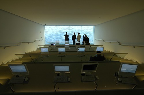
I suppose I should say at this point that overall, I did enjoy the building.  It is an interesting and unique building, and the sky-lit galleries were spacious, flexible, and appropriate for their contents.  One of the most interesting of the interior spaces was the media room, a stepped mini-auditorium-type space that looks down to the harbor.  When you are in the room, you really do feel as if you are hovering just above the water as if by magic.  On the exterior of the building, underneath this "hanging" volume is a large stepped amphitheater which focuses a major public space along the water's edge.

Trendy building or not, I am such an archi-phile that sometimes I hardly notice the artwork when I'm in some museums (like the Kimbell, for instance).  But if you happen to find yourself in Boston on or before September 7th this year, I highly recommend a visit to the ICA to see their temporary exhibition of Anish Kapoor's work.  The show is stunning and Mr. Kapoor's artwork is somehow incredibly mesmerizing!  (And, dare I say it, more interesting than the building it is sitting in right now!)