Thursday, September 16, 2010

Sketches from Memory

The other day I received a drawing from my eight-year old son, Lucas. He really loves to draw and he occasionally likes to draw architecture for me! I was totally impressed when the subject of his artwork this time was the Museu Oscar Niemeyer in Curitiba, Brazil, which we visited together as a family last November.


What is most impressive to me is that it was drawn completely from memory, but it shows all of the important architectural elements: the distinctive shape of the olho (eye) gallery; the singular blocky support; the reflecting pool; the sinuous ramp; and the mosaic of a dancer, in the correct pose! (As a side note, don't you just love the cloud and sun? These are his trademark, and I love them!)

I found a photo online of Oscar Niemeyer showing one of his sketches of the museum. Hmmm. Maybe Lucas will end up being a famous Brazilian architect, too!


Now, just in case you cannot see it all from Lucas' drawing or Niemeyer's sketch and are wondering what the building looks like in person, below is a photo I took from our visit. You can find more photos of the project here, my original blog post about the project.


. . . . . . . . . . . . . . . . . . . . . . . . .


More recently, we drove through Toronto and visited the CN Tower. Here is his drawing of that building, from memory again, complete with tapered concrete structure, glass elevator, the lower observation deck and the higher SkyPod, and the antenna, all towering over the rest of the city.


Oh yeah, and there is that fantastic sun again!

Thursday, July 15, 2010

Design Discoveries

Today Google celebrated the 125th anniversary of the birth of designer Josef Frank by posting a doodle based on his textile designs. Although I had heard of Josef Frank before, I was not really familiar with his work. Since I quite liked the Google doodle, I searched for more of his work and was really pleased with what I found.

I found a bunch of his work represented on the website for the Swedish design store Svenskt Tenn. I really love his use of color and form, and his floral prints are amazing. I have already pinched a number of his designs to use as desktop wallpaper on my computer!

Here are some of my favorite Josef Frank designs.

Tuesday, June 15, 2010

Mini-Miami

Last week I was in Miami for the first time for the 2010 American Institute of Architects (AIA) Convention. Since I still had the lenses I rented for my camera with me, I decided to play around with the tilt function of the tilt-shift lens in order to do what Wikipedia refers to as "miniature faking." This is a technique used notably by photographer Olivo Barbieri.

Where the shift function I wrote about in my previous post is helpful in correcting perspective, the tilt function can do some pretty funny things with the camera's depth of field. It tends to blur out the edges of the photograph and keep only one small area in focus, which simulates to a degree the appearance of macro-photography. It is especially effective if the photo is taken from a slightly aerial view in order to further add to the illusion that the photograph is of an architectural model or a diorama of some sort.

I discovered a couple of addition things through my own experiments that help add to the illusion of the photograph:
  • Architecture makes a really good subject. (OK, I admit, architecture always makes a good subject!)
  • The photograph should include objects both close and far away.
  • People can help if they end up being in the blurry portion of the photograph, although they tend to ruin the illusions somewhat if they are too much in focus.
Sure, with digital photography, all of this could be done post-production with Photoshop. But somehow the photography purist in me likes to think that the art of a finished print begins with the initial image captured by the camera in the first place.

Mini-City Hall

Mini-Bacardi from Biscayne

Mini-Bacardi from Plaza

Mini-Bacardi Annex


Mini-1111 Lincoln Road Garage

Mini-Plaza

Mini-Plaza Aerial


Mini-Hotel


Mini-Lifeguard Stand

Mini-Vizcaya

Mini-Hedges

Mini-Staircase

Mini-MIA

Saturday, June 5, 2010

Tilt-Shift

Next week, I am traveling to Calgary on business and will be using the opportunity to take some construction photos of Eighth Avenue Place. In order to capture some more professional-looking images, our office photography guru suggested I rent a couple of lenses for my Canon EOS Rebel XSi. I rented a tilt-shift lens and a zoom lens.

After a brief lesson when the lenses arrived at the office on Friday, I packed up and brought them home to "play" with for the weekend. On Saturday, I went with my two oldest children to Yale's campus to photograph the Beinecke Rare Book Library. Beinecke has always been one of my favorite buildings on campus, and I was excited to photograph the building with the new set of eyes, so to speak.

Although I had a nice time playing with the zoominess of the zoom lens, my new favorite lens has got to be the tilt-shift! It seems to be an especially exceptional lens for photographing architecture as it maintains proper perspective, and makes architecture appear...well...more architectural.

This photo shows the Beinecke as it would appear in a typical photograph. Because of the low position of the tripod, I had to tilt the camera up to see the whole building. However, with the plane of the lens no longer horizontal and parallel to the actual horizon, vertical lines appear to converge toward the top of the photo. (And, yes, I did pick Beinecke also because it has a gridded facade on which it would be easier to gauge the perspectival quality of the photograph.)
In order to get the parallel verticals back to vertical, I tilted the camera back down to horizontal. Because the "horizon" of a camera lens will always be in the center of the photograph with a typical lens, the only way to accurately represent a perspectival view is to keep the camera horizontal. But, as you can see, keeping the shot perfectly level cuts off the top of the building and gives me way too much foreground for a well-composed photograph.

Now for the fun part. Using the shift function of the tilt-shift lens, I shifted the lens up, which moves the horizon down in the photograph. However, because I did not angle the body of the camera up, the proper perspective is retained. Verticals remain vertical, and parallel horizontals appear to converge toward two vanishing points in the distance. Just like they taught you to draw a perspective in architecture studio!

Friday, May 28, 2010

A Little Bit of Excitement


For the past few years, I have been working on a highrise project in Calgary, Eighth Avenue Place. The project is currently under construction, well under way to being completed next year. I visit the site every couple of weeks to meet with our local partner architects in Calgary, the construction manager, and the general contractor.

This week was an important week for a site visit. My boss for the first time in a long time, was flying out to Calgary to see the project and to present a mockup of our fancy-schmancy lobby lighting scheme to a group of about 15 project owners and their representatives. No sooner had we stepped on site together for a tour Wednesday afternoon than we were evacuated from the building, along with many hundreds of construction workers! The culprit: a fire on the roof of the building podium.

Fortunately, nobody was hurt, and the fire was extinguished before it looked like any major damage to the structure occurred (although we are awaiting final reports of the damage from the contractor and a number of consultants). I can imagine that construction fires are probably some of the most dangerous building fires, as fire control control systems (sprinklers) are not yet functioning and many of the fire exits (stairs) are still under construction and/or blocked for construction.

Also fortunately, after a delay of a few hours, the fire marshall gave the all-clear and we and the workers were allowed back on site--and most importantly the owners, who had come in from all across Canada, were able to review the lighting mockup in the evening after all. We had been chasing our tail with the mockup for a couple of months, and were a little bit nervous about how the owners would receive it. But in the end, the owners accepted the scheme unanimously. Bullet dodged.

Never a dull moment.

And you thought architecture was boring!

[Here are a couple of articles from the press: article 1, article 2.]

Wednesday, May 19, 2010

Olympic Logos: Biggest Loser

For each medal winner in the Olympics, there are many others who must lose. In the realm of Olympic logos, there is one logo that is, without a doubt, the biggest loser.

London 2012's logo breaks all of the rules when it comes to good Olympic logo design. It is graphically awkward and uncompelling, has nothing to do with what I imagine is current thinking on "good" graphic design, and expresses nothing of the city or country in which the Olympics will be held. Just be glad I did not post the logo in its official magenta color with yellow shadows!

I hope the image speaks for itself, but if you want to read more, just click here.

On the other hand, many people have suggested alternatives to the London games. Here are some images of some alternate logos that I think are quite nice. Some of these could have even been in my medal rankings!

I actually think the current design would be much improved if it just used the Union Jack coloring, as proposed above.

I really like this particular proposal, probably the best of all the alternates I saw online. It is simple and graphically strong. The ribbons follow the path of the Thames River through London. Subtle. Elegant.

This particular proposal is interesting in the way it incorporates "2012" into the city name, although I cannot help but read "Zoizdon" when I see it, so it could use a little work.

Except for the tagline "We've got the Olympics in us!" I think this one is graphically very strong as far as a logos based on typography go.

I like the concept of this one more than the execution, but I think it has potential. The idea of the city as a hand with the line of the Thames River running through it is strong, but the coloring and typography is a bit unrefined to my eye.

[This post is part 5 of 5. Click for parts 1, 2, 3 & 4.]

Olympic Logos: Bronze Medal Winners

Part of me really likes really likes Atlanta 1996's logo, and part of me is really bothered by some of its elements. The part that likes it won enough to give this logo a Bronze Medal ranking. I really like the way the 100 (representing the Centennial Olympics) and the Olympic rings fit together to make a Greek column capital and an an Olympic torch. I am bothered by the colors in this particular version of the logo, which seem to me to be dated colors and not really timeless. I also am bothered by the flame that becomes stars. Overall, it is a strong concept, but I think the finished result appears to be trying to hard.

Barcelona '92's logo is simple and reasonably elegant. The jumping figure reminds me of Olympic gymnasts.

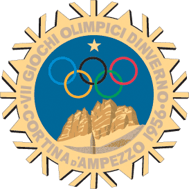
Cortina d'Ampezzo 1956's logo is quite nice. It is a little less iconic and a little more illustrative than I generally like, but I think it is well-executed and has a strong graphic-art feel to it. The mountains represent the mountains that sit above the small Italian town of Cortina d'Ampezzo. I only wish the logo did not have that pesky star in the sky above the Olympic rings. I think it would have been stronger without it.
It is also much better than the mountain logo used in the 1936 Olympics. What is with the ski tracks leading up to the base of the mountain behind the Olympic rings!? Just to be clear, this particular logo is in here for comparison, not because I am awarding it any sort of medal.

Here I am again, sucked in by Helsinki 1952's use of architecture in its logo. The building represented is the Helsinki Olympic Stadium. The design of the building and the design of the logo are very easily placed as early Scandinavian Modern, so in that sense this logo expresses both spirit of place and spirit of time in its design.

Like Mexico '68's logo, Amsterdam 1928 uses typography as the logo, which I like. It also looks very appropriate for both the time and the place, with definite cues taken from Dutch Modern design of the era.

[This post is part 4 of 5. Click for parts 1, 2, 3, & 5.]

Olympic Logos: Silver Medal Winners

Beijing 2008's logo is very nice. To my Western eyes, it looks very Chinese in both design and typography (or is it calligraphy). The human figure is based on the Chinese character for "Jing," which represents the host city. The only reason I did not give it a Gold Medal ranking is because it is less like an icon than I generally like.

Torino 2006's logo, on the other hand, is very iconic, and the only reason I did not give it a Gold Medal ranking is because I could not figure out what the logo had to do with the city of Torino or the country of Italy. However, Torino did have my favorite Olympic medals of all time. I just love the "donut" design with the looped around ribbon!

Athens 2004's logo features a representation of the olive wreath which ancient Olympians were crowned with after winning. The blue and white color of the logo are from the Greek flag.

Seoul 1988's logo is graphically simple and very iconic. The color and pattern look very Korean to my Western eyes.

I think the central graphic element of Grenoble 1968's logo is quite beautiful. I think this logo fits into my "wild card" category of logos I like because I cannot quite put my finger on why I like it so much.

Mexico '68's logo is a great example of a logo that succeeds on typography design alone. I love the way the Olympic rings are integrated into the year.

I cannot put my finger on it, but for some reason I like the logo for 1960's winter games in Squaw Valley, California. I do not know what the logo means, but it is graphically strong, and it is hard to go wrong if you stick with primary colors and platonic shapes. To my design eye, it looks very 1960.

There have been a number of logos for winter games that have used a snowflake theme, all of which I like. Although they are all graphically strong, I did not give them Gold Medal rankings because snowflakes could really have to do with any place wintery. They do not express the "spirit of place" of the host city or country like many of my Gold Medal winners do.

[This post is part 3 of 5. Click for parts 1, 2, 4 & 5.]