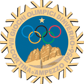
 Cortina d'Ampezzo 1956's logo is quite nice. It is a little less iconic and a little more illustrative than I generally like, but I think it is well-executed and has a strong graphic-art feel to it. The mountains represent the mountains that sit above the small Italian town of Cortina d'Ampezzo. I only wish the logo did not have that pesky star in the sky above the Olympic rings. I think it would have been stronger without it.
 It is also much better than the mountain logo used in the 1936 Olympics. What is with the ski tracks leading up to the base of the mountain behind the Olympic rings!? Just to be clear, this particular logo is in here for comparison, not because I am awarding it any sort of medal.
 Here I am again, sucked in by Helsinki 1952's use of architecture in its logo. The building represented is the Helsinki Olympic Stadium. The design of the building and the design of the logo are very easily placed as early Scandinavian Modern, so in that sense this logo expresses both spirit of place and spirit of time in its design.

Like Mexico '68's logo, Amsterdam 1928 uses typography as the logo, which I like. It also looks very appropriate for both the time and the place, with definite cues taken from Dutch Modern design of the era.
No comments:
Post a Comment