Over lunch today I had the opportunity to take a tour of the Yale Memorial Carillon in Harkness Tower. I went with Kim, Kyrie, and three colleagues from work. Our tour was led by Will, an enthusiastic member of the Guild of Carillonneurs, which is the student organization that rings the bells every day during the academic semester and organizes special concerts in the summer.
Harkness Tower from the roof of the Loria Center.
Lest you decide not to read further, I'm actually going to start the story with a little bit of bragging about the best part of the tour, which happened at the end. After forty-five minutes learning about the Carillon, the Guild, and listening to Will play from inside the tower during the 12:30-1:00 slot, I had the opportunity to ring the 1:00 hour! So, if you were in downtown New Haven today and happened to hear the 1:00 chime...um, yeah...that was me! (Also awesome was that, leading into the 1:00 chime, Will played the theme to 2001: A Space Odyssey).
Me, playing the bells for the 1:00 hour.
Ok, now back to the beginning of the story. Harkness Tower sits in the corner of Branford College's courtyard and is a prominent feature on High Street, over Old Campus, and in downtown New Haven. It is 216 feet tall, which is one foot for each year since Yale's founding to the time the tower was built.
The corner of Harkness Tower
from Branford College courtyard.
"This was taken from 72 feet below ground
in leveling bedrock for the
caisson foundations of this tower."
Interior view of the stairwell at the base of the tower.
Above the Memorial Room at the base of the tower, there is an office level for the Guild of Carillonneurs, and two practice carillons. (The water tanks referred to in the infographic below have been removed, but they took up a circular area left open in the center of the tower left open for the bells to be brought up internally one-by-one with pulleys!)
The two practice carillons are set up with the exact same layout as the large carillon, except the mechanism strikes chimes instead of bells. Although the layout is the same, there is a difference in the "weight" of the keys that one experience playing the actual carillon, since the full scale mechanism mechanically strikes the bells with clappers.
Kim with one of the practice carillons.
The second practice carillon.
The practice carillons are heavily-used by the Guild, as typical practice sessions are not possible on the bells, which only chime and play during certain hours. Not to mention the complaints from the community if the bells chimed out a practice session which, if my high school piano lessons are any example, are some days cacophonous at best!
Using the practice carillons, the Guild trains and auditions incoming freshmen to play, ultimately winnowing down a field of 80+ hopefuls through an intense process to those required to keep the Guild membership at 15, with each guild member playing once a week.
The Carillon keyboard.
Cables from the carillon keyboard go up into the belfry & operate clappers to sound the bells.
As part of his weekly playing, Will treated us to a performance of Erik Satie's Gymnopedie No. 1.
There are 54 bells in the Yale Memorial Carillon, for a range of 4.5 octaves. Originally, only 10 bells were installed in the tower in 1922. This was expanded to the current 54 bells in 1964. The bells have been rung by students since 1949.
The carillon playing chamber is only half way up the tower, and a spiral staircase goes to the tower crown. Too bad for this architect who likes high places, we were not allowed to climb the tower for insurance and security purposes.
Even so, in addition to the awesome experience of seeing, playing, and hearing the carillon from inside the tower, the views of New Haven are awesome! There are two locations you can come out of the tower onto small balconies, about a third up the tower in the Guild office, and adjacent to the playing chamber half way up the building.
Dwight Chapel & Linsly Chittenden Hall from the Guild Office.
Looking North over Branford and Saybrook Colleges from the Guild Office.
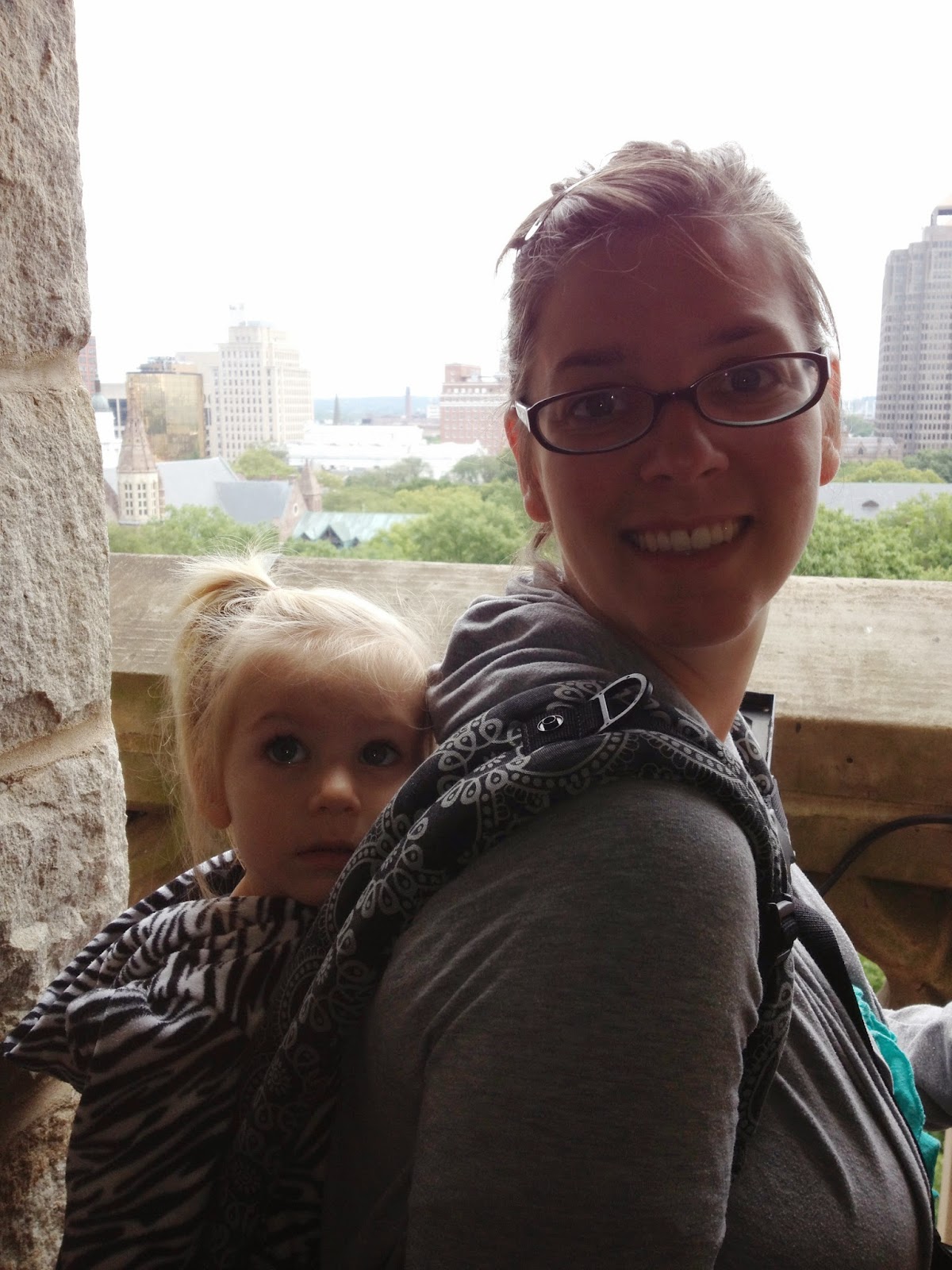
Kim & Kyrie overlooking downtown.
The view up from the playing chamber...
...and the view down.
Looking west over Branford College from the playing chamber.
Branford College Courtyard in the foreground with Wrexham Tower (Saybrook College) beyond.
Looking down into Branford College courtyard from the playing chamber.
The view east over Old Campus & downtown New Haven from the playing chamber.
Looking at the tower from the outside, the Guild office is just below the louvered windows, with two little bump-out balconies on each tower face. The playing chamber is just above the louvered windows, with a linear balcony on each face. The bells extend up just beyond the clock, and the crown of the tower sits above the bells.
Harkness Tower from High Street.
Harkness Tower from High Street.
A recent view of campus from the roof of the Loria Center with Harkness Tower on the right.
This doodling thing has gotten me interested in learning more about traditional architectural and decorative ornament, so I checked out a few books from Yale's library: The Grammar of Ornament by Owen Jones and The Sense of Order by E. H. Gombrich. The following Celtic knotwork pattern is based on an illustration from the latter.
Last summer I had the awesome opportunity to design the website graphic for my church's sermon series in Book Two of the Psalms. Since then, I've had the pleasure of working with one of the pastors to create several additional sermon banners. The process has been fun and it has been a chance for me to expand my graphic design exposure.
Next week, we will begin a sermon series on the story of Joseph contained in Genesis chapters 37 through 50. The title of the series, God Meant it for Good: the Gospel According to Joseph, is based on a passage at the end of chapter 50 where Joseph reassures his brothers, who had previously sold him into slavery, that what they had meant for evil, God had meant for good. (Read the whole story starting in chapter 37.)
Now, when many people think of Joseph, they think of his famous coat of many colors. Though the coat is a relatively small detail near the beginning of Joseph's story, this was my first association as well, and I initially started thinking of using a colorful textile pattern as the backdrop for the graphic. However, I was unhappy with the uber-literal concept. We weren't, after all, staging a revival of Joseph and the Amazing Technicolor Dereamcoat! I began to wonder, what could I use that is colorful, textured, and layered, but isn't a literal piece of fabric?
After some web sleuthing, I settled upon the hand-marbledend papers often found in antique books, and I remembered that I had just the book: a mid-nineteen century edition of Alexander Pope's poetry with some awesome marbling. I photographed the end papers and, through the magic of Photoshop, transformed the warm palette of the original to a cool blue palette that worked with the blues of the church logo and website.
With the addition of simple text, including the series title and key verse, the result is a textured, colorful graphic that, I hope, offers open associations. Yes, it is colorful like Joseph's coat. But it is also textured, layered, and nuanced--much like the story of Joseph. It also brings to mind, perhaps, the old family Bible, passed down through generations. Or the textures of a middle-eastern desert. Or perhaps the subtle blue waves of the Nile River from Joseph's Egyptian exile.
Within the past year, I've also produced two additional website graphics.
Our previous Sunday morning sermon series, which began in fall 2013 and was completed over the course of a year, was entitled Looking to Jesus: A Series in the Book of Hebrews. The solution for that particular graphic was entirely typographical, with the series title and key verse floating over top of a background listing all of the names of Jesus used in Hebrews.
Lastly, the Sunday evening sermon series for fall 2013 was entitled The Real Jesus: A Series in the Gospel of Mark. For the website graphic, a simple silhouette of Jesus from one of the church's stained glass windows is cut out of a cool blue background gradient based on the colors of the church's trefoil logo.
"A drawing is simply a line going for a walk." - Paul Klee
Wow, I can't believe it's been almost a year since I last posted on my blog. I'm going to have to work on that!
I was recently feeling a little sad that I don't often find the opportunity to sketch or draw in my usual work and life schedule. I got to thinking about people who make a sort of photo journal where they post a photo each day for a year. Although I love walking around with my iPhone camera and usually take (and post on Facebook) lots of photos, I wanted my "challenge" to be a bit more hands-on.
So, I'm going to try to do what I hope will be daily (or at least frequent!) sketching. No rules. Just trying to keep creativity flowing by doing one drawing a day. In order to hold myself a little more accountable, I'm going to post the fruits of my labor here, tagged with "Doodle-a-Day."