Wednesday, May 19, 2010
Olympic Logos: Gold Medal Winners
Olympic Logos: Introduction
Given my growing interest in graphic design, in the relatively recent wake of this year's winter games in Vancouver, I thought it would be interesting to look at Olympic logos throughout history. (You can find a full list of Olympic Games and host cities here.) After looking at all of the logos from the modern Olympics, I critiqued them through my own design eye and grouped the best of them into three categories: Gold Medal, Silver Medal, and Bronze Medal winners.
But before I get to the pretty pictures in the next few posts, there are a number of themes that I observed while evaluating the graphic power of the logos. Based on my observations, the best Olympic logos exhibit the following characteristics.
- Graphic Simplicity: The best logos are simple, adhereing to the adage that "less is more."
- Spirit of Place: The best logos express something unique about the host city or host country.
- Spirit of Time: Graphic design aesthetics change over time. And although I am a product of my own time and therefore most of my medal winners are from more recent Olympics, in their graphic representation, the best logos generally express the spirit of their own time.
- Wild Card: Sometimes the best logos are mysteriously compelling for no objective reason.
Tuesday, May 11, 2010
Too Close for Comfort?
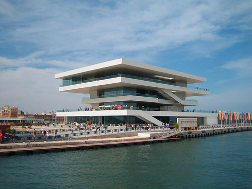
Do these buildings look the same to you? Look closely. They certainly look similar: floating slabs with glass railings ringing the building with exterior circulation, exposed stairs along the perimeter, and both situated right on the water. Maybe the first is just the concept rendering for the photo of the completed building. Right?
As in many aspects of life, in architecture there is indeed nothing new under the sun--or at least, not much! Architects are always looking at other architects' work and the built environment around them to get ideas about design. We are always looking at history--from ancient to recent--for inspiration. After all, how many mid-20th century glass office buildings were spawned in the wake of Mies van der Rohe's Seagram Building.
So now back to the big question: are these two images supposed to be of the same building?
The second image is a photograph of David Chipperfield's America's Cup Pavilion, completed in 2006 in Valencia, Spain. The first image is AART Architects VUC building, an adult education center slated for Haderslev, Denmark. I was stunned when I received my World Architecture News newsletter last month with the image of the VUC building--it immediately made me think of Chipperfield's project, and I wondered what the architects at AART were thinking as they proposed their project.
I suppose I have more questions to ask about intellectual property rights in architecture than answers to give, as I too am certain to be a culprit from time to time. After all, total innovation in architecture is difficult, probably unwise, and may not even make good architecture! So, here are a few points to ponder:
- Where do you draw the line between inspiration and plagiarism in architecture?
- Would it make a difference whether an architect is aware of the similarity in question or not? What if AART had never seen Chipperfield's project?
- Does it matter whether the architect of the original project is still alive?
- When does a similarity between two buildings turn into an actionable lawsuit?
- What if architects can clearly see the nuances between two projects but John Q. Public sees them as the same? When we talk design issues at work, my boss sometimes talks about the "mom test." I.e. would his mom "get it." Do we have to put this question on mom?
- What can we learn from other design or art fields? For instance, I heard a piece of music on the radio the other day that sounded so much like Aaron Copland that I thought it must have been a piece of his I had never heard before. When I discovered it was Julián Orbón instead, I looked him up on Wikipedia to find out he had studied under Copland. So is using a riff or some instrumentation of a mentor OK? Is this like taking a cue from Corbu in architecture? Or listening to your studio teacher in school?
I am inclined to think that some bit of similarity in architecture is entirely appropriate. But as for these two projects, I think they are a little too close for comfort.
I wonder if Chipperfield has seen AART's project?
An Afternoon at the Biltmore
The view from the main entrance back toward the front lawn.

The ground at the back of the house drops away in a steep hill.
The terrace to the side of the house is a great place for kids to run around after having been calm for so long on the house tour!
The stunning view to the mountains . . .

. . . from this arcade on the first floor.
A wisteria-festooned pergola leads down from the house to the main flower garden.
The walled flower garden in early spring is a stunning sight indeed.

The trellis-work in the walled gardens frames the many varieties of tulips.
On the other side of the walled garden is the greenhouse.

The greenhouse was filled with tropical plants, including palms and orchids.
Friday, February 5, 2010
Not My Type
Though I enjoyed many of the essays in the book, it was not simply the writing that kept me turning the pages. With each essay set in a different font, I have to say that one aspect of the book that I really enjoyed was the typography. Yes, that's right. The typography! With each new essay, I found myself excitedly turning to the appendix to see the name of the font, the designer, and the year.
I cannot say that I have "always" been interested in typography and type design, but it is a fascinating field that has been on my radar ever since reading an article about fonts and font design in Metropolis a number of years ago. The recent documentary Helvetica (yes, it is indeed a documentary about a typeface) and this book have only served to whet my appetite once again. And in the interest of full-disclosure, it has reminded me that someday I would love to design a typeface.
But as with the "aha" moment I had back as an undergraduate in my architectural technology class when I was taught about control joints in masonry walls and then all I could see as I walked around for weeks after was control joints, control joints everywhere, after reading this particular book on a business trip, all I could see as I walked around the Minneapolis airport on my layover was typography, typography everywhere!
There was some great typography, some awful typography . . . a lot of very average typography. I found myself walking through the immense terminal wondering about the graphic designers that designed ads for convenient airport parking (with the smiling car silhouette), or the logo of the store that sells Minnesota souvenirs (with the larger-than-life cartoonish moose poking through the storefront), or the graphic designer who chose the font for all of the standard MSP airport wayfinding signs (it may very well be Helvetica).
One example of typography I found particularly bothersome, though, was the name of what appeared to be a high-end leather store. The store, Wilson's Leather, featured a logo in all caps and no spacing which said "WILSONSLEATHER." There was a minor change in type weight between the two words and the whole logo was rotate 90 degrees clockwise, to be read down with your head cocked to the right. This strange confluence of design decisions, including the blatant omission of an apostrophe, meant that all I could read was, "Wilson Sleather." I looked at the sign over and over again wondering why I could not read it the right way.
One of my pet peeves, especially in advertising, is what I like to call "malapostrophication," which can happen either by inclusion or omission. For instance, I cannot walk past the storage boxes at my office without seeing "Bankers Box" and thinking, "well, I'm sure some bankers must enjoy the sport of boxing." On the flip side, I do have to admit that sometimes there are times when the purposeful lack of an apostrophe (and jamming two words together) can work. Take PETSMART for instance.
I guess my unfortunate run-in with bad typography in an airport in Minnesota illustrates the ever-present curse of the designer. Once your eyes have been opened, it is hard to un-open them.
As for now, I'll just keep wondering. What is a sleather anyway?
*****
Postscript: You can find some of the essays included in the book 79 Short Essays on Design, as well as more of Michael Bierut's writing, on the Design Observer blog.
Wednesday, January 27, 2010
Museu de Arte Moderna
Project Date: 1967
Location: Rio de Janeiro, Brazil
Architect: Affonso Eduardo Reidy
Date Visited: 14 December 2009
After five weeks in Curitiba, we spent a week in Rio de Janeiro before returning home to the United States just before Christmas. Though we had some business to take care of at the U.S. Consulate, we spent quite a bit of time enjoying the sights and sounds of Rio, including some of its (in)famous Modern Architecture!
On our way to Roberto Burle Marx's Parque Flamengo, we strolled past Affonso Eduardo Reidy's Museu de Arte Moderna, an iconic work of Brazilian Modern Architecture. The concrete exhibition building is lifted off the ground on large, sloped columns which support an overhanging roof, used as a sunshade to shield the glass walls from Brazil's harsh sun. Walking underneath is sort of like walking under a giant, concrete centipede!
Friday, December 25, 2009
Merry Christmas!
Wednesday, December 23, 2009
Classic Toys Never Go Out of Style
In 1954, Modern designers Charles and Ray Eames created their famous House of Cards picture deck. In 2009, I introduced my 4 year old son to the classic toy.
It was an immediate hit, although I don't know whether it was me or him who enjoyed playtime more!
Friday, November 27, 2009
Museu Oscar Niemeyer
Kim and I have been in Curitiba, Brazil, since the beginning of November when we arrived to adopt our four beautiful children (visit our other blog, Perfect Provision, for details about this adventure). We have enjoyed a number of sites around the city during the month we have been here, but today was especially exciting for me as we went to the Museu Oscar Niemeyer, an art museum designed by and named in honor of Brazil's most famous architect. This was sort of an early birthday present for me, as my birthday is next week, and Kim was gracious enough to let me pick out my own birthday present from the museum store, a few books on Niemeyer that are only in Portuguese and not available in the United States!
If you know me personally or if you have read past entries on this blog, you are probably already aware that I am a big Niemeyer fan. Of course I was most excited to come to Brazil to meet my children, but a close second was the opportunity to see a few of Niemeyer's buildings in person. The Museu is Niemeyer's only work here in Curitiba, but I hope to have the opportunity to see a number of additional projects when we are in Rio de Janeiro for a week in December before returning home to the United States (don't worry, it's not all play--the kids have to pick up their visas from the US Consulate there). I even have this silly notion that I could meet Oscar Niemeyer himself while we are there, though I do not quite know how I am going to arrange this. He will be 102 years old in December, the last great living Modernist!
The Museu Oscar Niemeyer is also known as the "olho," or "eye." Just look at the pictures to see why! This distinctive piece of architecture was added by Niemeyer in the early 2000s to an 1960s era building, also by Niemeyer. The whole complex together is pretty impressive and features a number of Niemeyer trademarks, including the use of interesting geometric figures, reflecting pools, sinuous ramps, and artistic tile work (a Portuguese and Brazilian tradition).
Visitors to the museum first enter into the original building and tour the exhibits there. In the basement of that building, there is a tunnel that leads under the reflecting pool to the base of the eye. Elevators and stairs take the visitor up to the exhibition level, which is one huge, arced space. Unfortunately due to the exhibit inside, the eye had blackout shades installed, so it was really pretty dark. The ceiling was interesting though, made up of thousands and thousands of little metal rectangles. I really wish we could have seen the space in natural light because there is also an interesting sunshading screen along the glass faces of the eye.
As you might imagine, it is hard to find time to write a blog when four kids are keeping me busy enough! I have already written too much when I should be sleeping, so for now, I'll just let the pictures do the rest of the talking. Enjoy!
Subscribe to:
Posts (Atom)