Friday, May 28, 2010

A Little Bit of Excitement


For the past few years, I have been working on a highrise project in Calgary, Eighth Avenue Place. The project is currently under construction, well under way to being completed next year. I visit the site every couple of weeks to meet with our local partner architects in Calgary, the construction manager, and the general contractor.

This week was an important week for a site visit. My boss for the first time in a long time, was flying out to Calgary to see the project and to present a mockup of our fancy-schmancy lobby lighting scheme to a group of about 15 project owners and their representatives. No sooner had we stepped on site together for a tour Wednesday afternoon than we were evacuated from the building, along with many hundreds of construction workers! The culprit: a fire on the roof of the building podium.

Fortunately, nobody was hurt, and the fire was extinguished before it looked like any major damage to the structure occurred (although we are awaiting final reports of the damage from the contractor and a number of consultants). I can imagine that construction fires are probably some of the most dangerous building fires, as fire control control systems (sprinklers) are not yet functioning and many of the fire exits (stairs) are still under construction and/or blocked for construction.

Also fortunately, after a delay of a few hours, the fire marshall gave the all-clear and we and the workers were allowed back on site--and most importantly the owners, who had come in from all across Canada, were able to review the lighting mockup in the evening after all. We had been chasing our tail with the mockup for a couple of months, and were a little bit nervous about how the owners would receive it. But in the end, the owners accepted the scheme unanimously. Bullet dodged.

Never a dull moment.

And you thought architecture was boring!

[Here are a couple of articles from the press: article 1, article 2.]

Wednesday, May 19, 2010

Olympic Logos: Biggest Loser

For each medal winner in the Olympics, there are many others who must lose. In the realm of Olympic logos, there is one logo that is, without a doubt, the biggest loser.

London 2012's logo breaks all of the rules when it comes to good Olympic logo design. It is graphically awkward and uncompelling, has nothing to do with what I imagine is current thinking on "good" graphic design, and expresses nothing of the city or country in which the Olympics will be held. Just be glad I did not post the logo in its official magenta color with yellow shadows!

I hope the image speaks for itself, but if you want to read more, just click here.

On the other hand, many people have suggested alternatives to the London games. Here are some images of some alternate logos that I think are quite nice. Some of these could have even been in my medal rankings!

I actually think the current design would be much improved if it just used the Union Jack coloring, as proposed above.

I really like this particular proposal, probably the best of all the alternates I saw online. It is simple and graphically strong. The ribbons follow the path of the Thames River through London. Subtle. Elegant.

This particular proposal is interesting in the way it incorporates "2012" into the city name, although I cannot help but read "Zoizdon" when I see it, so it could use a little work.

Except for the tagline "We've got the Olympics in us!" I think this one is graphically very strong as far as a logos based on typography go.

I like the concept of this one more than the execution, but I think it has potential. The idea of the city as a hand with the line of the Thames River running through it is strong, but the coloring and typography is a bit unrefined to my eye.

[This post is part 5 of 5. Click for parts 1, 2, 3 & 4.]

Olympic Logos: Bronze Medal Winners

Part of me really likes really likes Atlanta 1996's logo, and part of me is really bothered by some of its elements. The part that likes it won enough to give this logo a Bronze Medal ranking. I really like the way the 100 (representing the Centennial Olympics) and the Olympic rings fit together to make a Greek column capital and an an Olympic torch. I am bothered by the colors in this particular version of the logo, which seem to me to be dated colors and not really timeless. I also am bothered by the flame that becomes stars. Overall, it is a strong concept, but I think the finished result appears to be trying to hard.

Barcelona '92's logo is simple and reasonably elegant. The jumping figure reminds me of Olympic gymnasts.

Cortina d'Ampezzo 1956's logo is quite nice. It is a little less iconic and a little more illustrative than I generally like, but I think it is well-executed and has a strong graphic-art feel to it. The mountains represent the mountains that sit above the small Italian town of Cortina d'Ampezzo. I only wish the logo did not have that pesky star in the sky above the Olympic rings. I think it would have been stronger without it.
It is also much better than the mountain logo used in the 1936 Olympics. What is with the ski tracks leading up to the base of the mountain behind the Olympic rings!? Just to be clear, this particular logo is in here for comparison, not because I am awarding it any sort of medal.

Here I am again, sucked in by Helsinki 1952's use of architecture in its logo. The building represented is the Helsinki Olympic Stadium. The design of the building and the design of the logo are very easily placed as early Scandinavian Modern, so in that sense this logo expresses both spirit of place and spirit of time in its design.

Like Mexico '68's logo, Amsterdam 1928 uses typography as the logo, which I like. It also looks very appropriate for both the time and the place, with definite cues taken from Dutch Modern design of the era.

[This post is part 4 of 5. Click for parts 1, 2, 3, & 5.]

Olympic Logos: Silver Medal Winners

Beijing 2008's logo is very nice. To my Western eyes, it looks very Chinese in both design and typography (or is it calligraphy). The human figure is based on the Chinese character for "Jing," which represents the host city. The only reason I did not give it a Gold Medal ranking is because it is less like an icon than I generally like.

Torino 2006's logo, on the other hand, is very iconic, and the only reason I did not give it a Gold Medal ranking is because I could not figure out what the logo had to do with the city of Torino or the country of Italy. However, Torino did have my favorite Olympic medals of all time. I just love the "donut" design with the looped around ribbon!

Athens 2004's logo features a representation of the olive wreath which ancient Olympians were crowned with after winning. The blue and white color of the logo are from the Greek flag.

Seoul 1988's logo is graphically simple and very iconic. The color and pattern look very Korean to my Western eyes.

I think the central graphic element of Grenoble 1968's logo is quite beautiful. I think this logo fits into my "wild card" category of logos I like because I cannot quite put my finger on why I like it so much.

Mexico '68's logo is a great example of a logo that succeeds on typography design alone. I love the way the Olympic rings are integrated into the year.

I cannot put my finger on it, but for some reason I like the logo for 1960's winter games in Squaw Valley, California. I do not know what the logo means, but it is graphically strong, and it is hard to go wrong if you stick with primary colors and platonic shapes. To my design eye, it looks very 1960.

There have been a number of logos for winter games that have used a snowflake theme, all of which I like. Although they are all graphically strong, I did not give them Gold Medal rankings because snowflakes could really have to do with any place wintery. They do not express the "spirit of place" of the host city or country like many of my Gold Medal winners do.

[This post is part 3 of 5. Click for parts 1, 2, 4 & 5.]

Olympic Logos: Gold Medal Winners

I actually think that Rio 2016's logo is one of the best Olympic logos, and not just because I am a Brazilaphile! It is graphically simple and strong and expresses the spirit of both Rio de Janeiro and Brazil in a number of ways. Having been to Rio recently myself, the logo instantly brings to mind images of Rio's beautiful landscape of ocean and hills, including the Pão de Açúcar. And the colors used echo the colors of the Brazilian flag, of which Brazilians are very proud.

Vancouver 2010's logo represents the Inuit stone monuments, known as Inukshuk. Vancouver also had some of my favorite Olympic medals. The wavy shape reminds me of the mountains of the Canadian Rockies as well as the ocean of the Pacific Northwest. The artwork on each medal is unique, which if all put together form a larger master work representing an orca.

Hidden in the image of a jumping human figure, Sydney 2000's logo represents elements of Australia's aboriginal art and culture, as well Sydney's iconic Opera House.

I was 14 years old when the Olympics were in Lillehammer Norway, but the logo made an impression on me even then. I love the simple graphic nature of it in its representation of the northern lights.

I guess I am a sucker for Olympic logos that feature architecture. Oslo 1952's logo is quite simple and graphically strong. It features a representation of the (at that time) recently completed Oslo City Hall. This medallion-like logo would have made a perfect Olympic medal!
[This post is part 2 of 5. Click for parts 1, 3, 4 & 5.]

Olympic Logos: Introduction

I am a self-proclaimed Olympiphile. In fact, the Olympics are pretty much the only sporting event I ever watch. But in addition to watching the amazing feats of the Olympic athletes, around game time, I always enjoy looking at the Olympic logos, medals, and venues from the perspective of a designer.

Given my growing interest in graphic design, in the relatively recent wake of this year's winter games in Vancouver, I thought it would be interesting to look at Olympic logos throughout history. (You can find a full list of Olympic Games and host cities here.) After looking at all of the logos from the modern Olympics, I critiqued them through my own design eye and grouped the best of them into three categories: Gold Medal, Silver Medal, and Bronze Medal winners.

But before I get to the pretty pictures in the next few posts, there are a number of themes that I observed while evaluating the graphic power of the logos. Based on my observations, the best Olympic logos exhibit the following characteristics.
  • Graphic Simplicity: The best logos are simple, adhereing to the adage that "less is more."
  • Spirit of Place: The best logos express something unique about the host city or host country.
  • Spirit of Time: Graphic design aesthetics change over time. And although I am a product of my own time and therefore most of my medal winners are from more recent Olympics, in their graphic representation, the best logos generally express the spirit of their own time.
  • Wild Card: Sometimes the best logos are mysteriously compelling for no objective reason.
[This post is part 1 of 5. Click for parts 2, 3, 4 & 5.]

Tuesday, May 11, 2010

Too Close for Comfort?


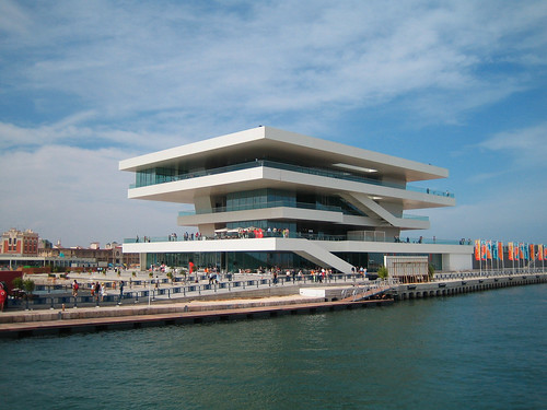
Do these buildings look the same to you? Look closely. They certainly look similar: floating slabs with glass railings ringing the building with exterior circulation, exposed stairs along the perimeter, and both situated right on the water. Maybe the first is just the concept rendering for the photo of the completed building. Right?

As in many aspects of life, in architecture there is indeed nothing new under the sun--or at least, not much! Architects are always looking at other architects' work and the built environment around them to get ideas about design. We are always looking at history--from ancient to recent--for inspiration. After all, how many mid-20th century glass office buildings were spawned in the wake of Mies van der Rohe's Seagram Building.

So now back to the big question: are these two images supposed to be of the same building?

The second image is a photograph of David Chipperfield's America's Cup Pavilion, completed in 2006 in Valencia, Spain. The first image is AART Architects VUC building, an adult education center slated for Haderslev, Denmark. I was stunned when I received my World Architecture News newsletter last month with the image of the VUC building--it immediately made me think of Chipperfield's project, and I wondered what the architects at AART were thinking as they proposed their project.

I suppose I have more questions to ask about intellectual property rights in architecture than answers to give, as I too am certain to be a culprit from time to time. After all, total innovation in architecture is difficult, probably unwise, and may not even make good architecture! So, here are a few points to ponder:
  • Where do you draw the line between inspiration and plagiarism in architecture?
  • Would it make a difference whether an architect is aware of the similarity in question or not? What if AART had never seen Chipperfield's project?
  • Does it matter whether the architect of the original project is still alive?
  • When does a similarity between two buildings turn into an actionable lawsuit?
  • What if architects can clearly see the nuances between two projects but John Q. Public sees them as the same? When we talk design issues at work, my boss sometimes talks about the "mom test." I.e. would his mom "get it." Do we have to put this question on mom?
  • What can we learn from other design or art fields? For instance, I heard a piece of music on the radio the other day that sounded so much like Aaron Copland that I thought it must have been a piece of his I had never heard before. When I discovered it was Julián Orbón instead, I looked him up on Wikipedia to find out he had studied under Copland. So is using a riff or some instrumentation of a mentor OK? Is this like taking a cue from Corbu in architecture? Or listening to your studio teacher in school?
I am inclined to think that some bit of similarity in architecture is entirely appropriate. But as for these two projects, I think they are a little too close for comfort.

I wonder if Chipperfield has seen AART's project?

An Afternoon at the Biltmore

A few weeks ago, we took our first long road trip as a family of six. As we headed down the east coast to see friends and relatives as far south as the Gulf Coast of Alabama, one of our stops was Asheville, North Carolina, where we visited Kim's grandfather. After a nice Sunday morning at church and lunch afterwards, we spent an absolutely beautiful afternoon at the Biltmore Estate.

If you ever find yourself in the Asheville area, the Biltmore is a must-see! Designed by architect Richard Morris Hunt and brilliant landscape architect Frederic Law Olmsted (designer of Central Park in New York City, as well as many famous neighborhoods through the country), and touted as America's largest home, it is a stunning tribute to the opulence of the Gilded Age.

Commissioned in the last decade of the 19th century by George Washington Vanderbilt II of the famous Vanderbilt family, I was stunned to learn that the huge house was the residence of only three people: Mr. Vanderbilt, his wife, and his daughter. This is a little bit of a funny statistic, though. The guides at the house confirmed that, in addition to numerous guests frequenting the estate, there was a house staff of more than 30, and that at one point, a census recorded 400 people working on the grounds of the estate!

The house is really beautiful and in the style of French chateaux. Unfortunately, photography was not allowed inside, so you will just have to take my word for it. On the other hand, I could not take enough photos of the gardens surrounding the house! The landscape around the house is delicate mix of natural landscape and formal landscape. During our visit in late April, the estate was celebrating its annual Festival of Flowers. Stunning!


The view from the main entrance back toward the front lawn.

The ground at the back of the house drops away in a steep hill.

The terrace to the side of the house is a great place for kids to run around after having been calm for so long on the house tour!

The stunning view to the mountains . . .

. . . from this arcade on the first floor.

A wisteria-festooned pergola leads down from the house to the main flower garden.

The walled flower garden in early spring is a stunning sight indeed.

The trellis-work in the walled gardens frames the many varieties of tulips.

On the other side of the walled garden is the greenhouse.

The greenhouse was filled with tropical plants, including palms and orchids.